GONG CHA / UNIQUE BUNNY
Located on Pembina Highway in Winnipeg, we worked with Holly Hock Construction and our repeat clients to design one retail space for two separate companies, Gong Cha & Unique Bunny.
BUILD Holly Hock Construction
PHOTOGRAPHY Nowaday Studio
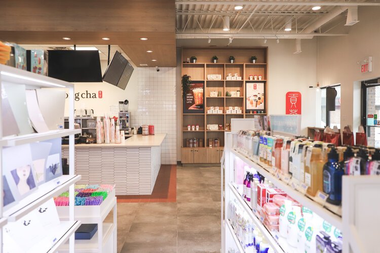
While both businesses have some overlap in customers, our challenge was to create a visually cohesive design while maintaining an obvious distinction between the two businesses.
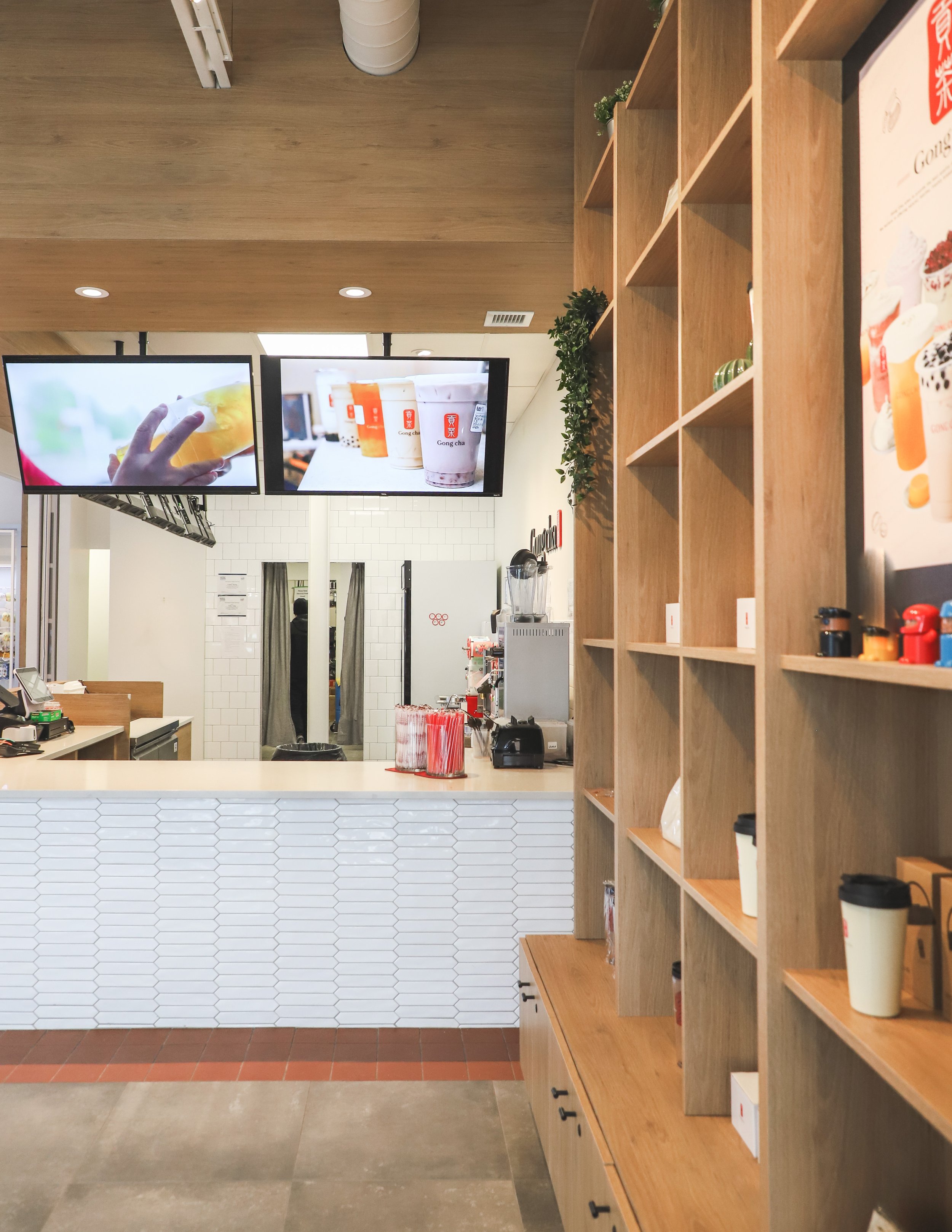
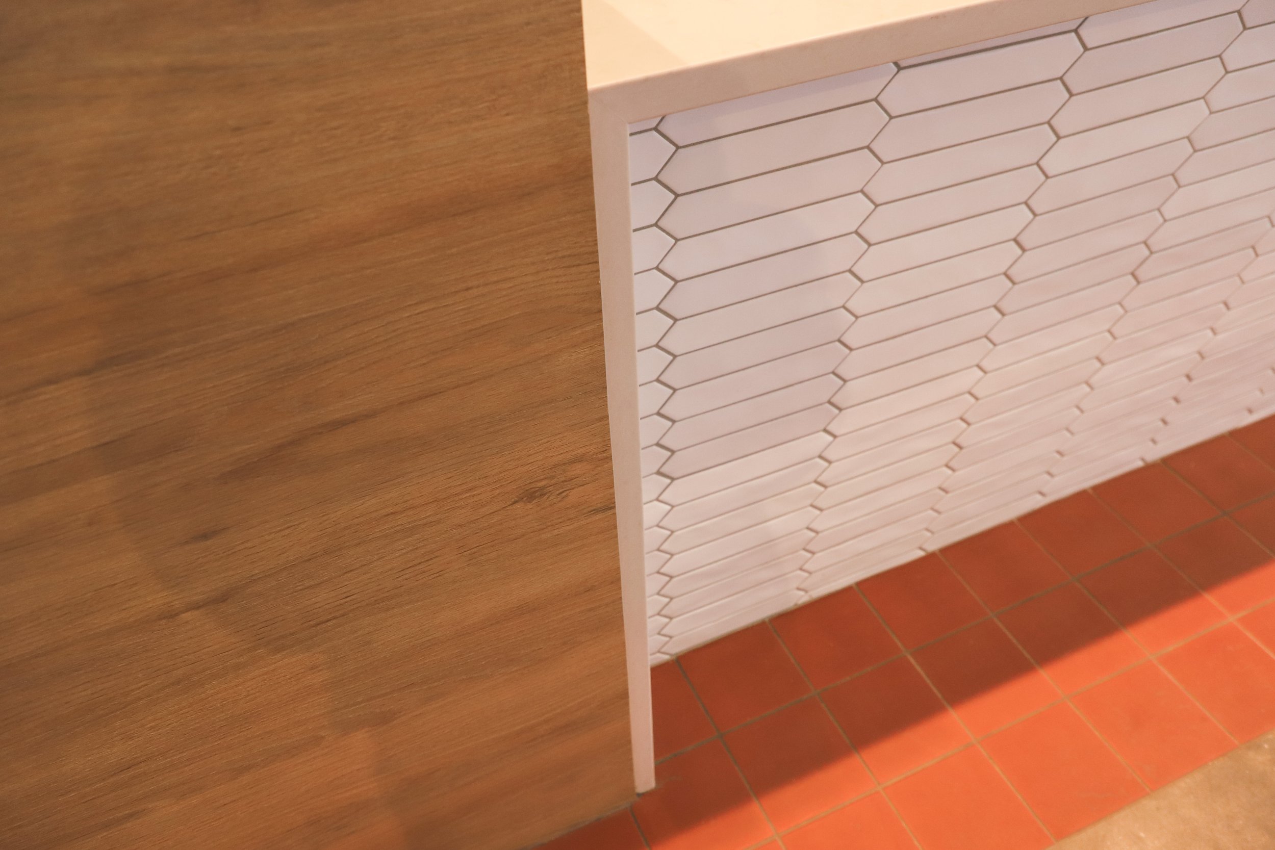
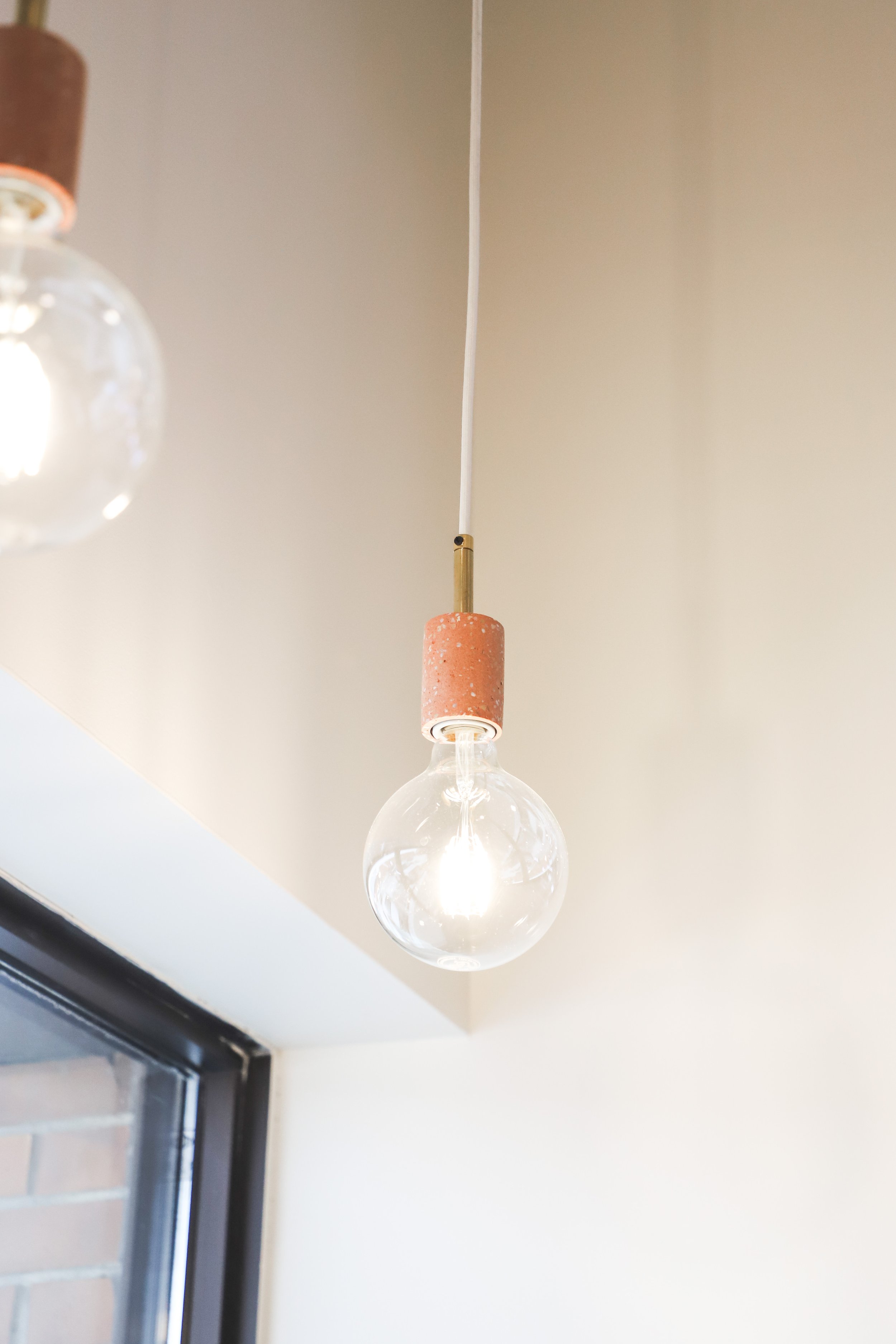
We accomplished this by using consistent flooring and lighting throughout the space, as well as incorporating similar custom millwork and design details on both sides.
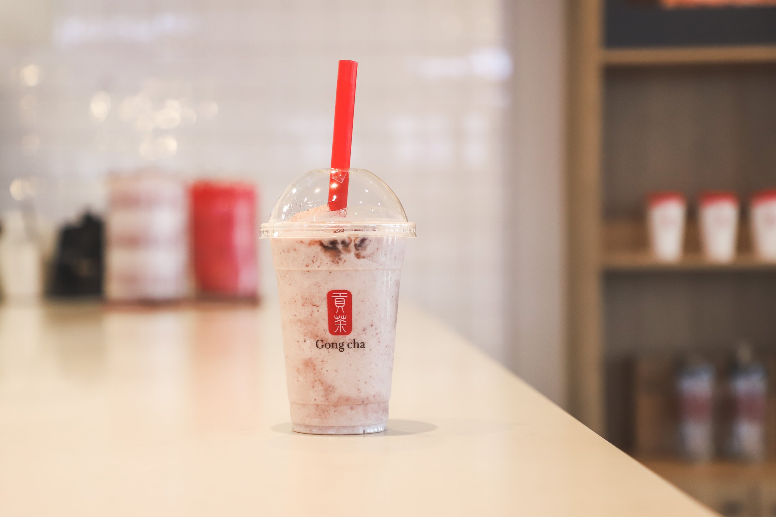
Gong Cha is a chain with many locations worldwide, and each location has its own atmosphere and vibe. This allowed for flexibility, but we also wanted to be mindful of unique brand details that we could draw on.
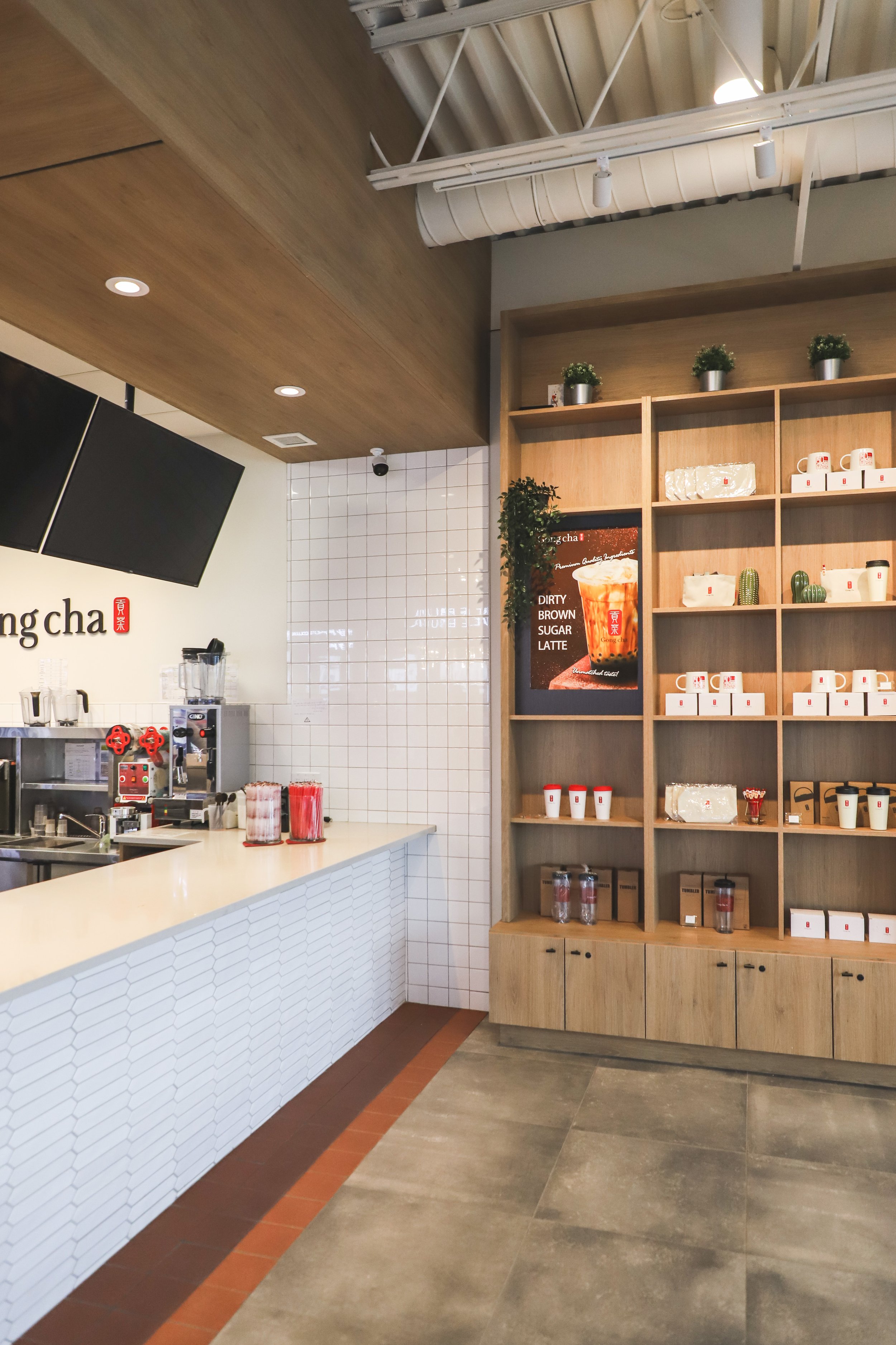
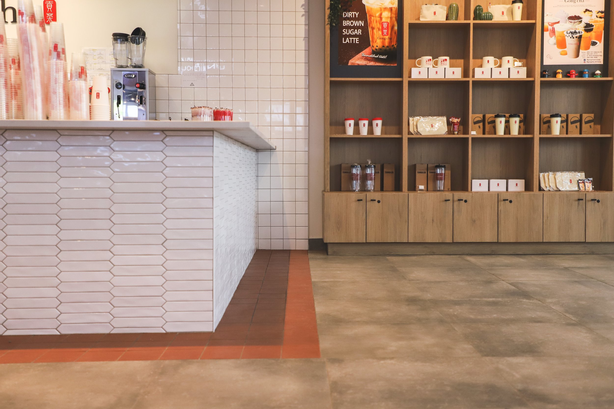
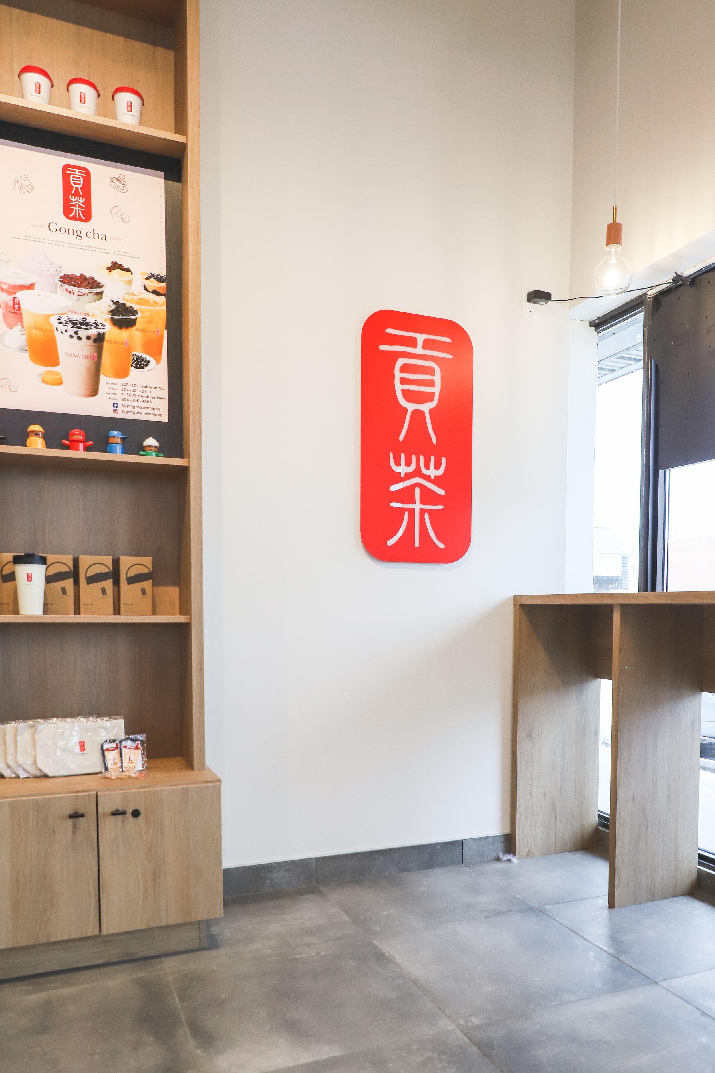
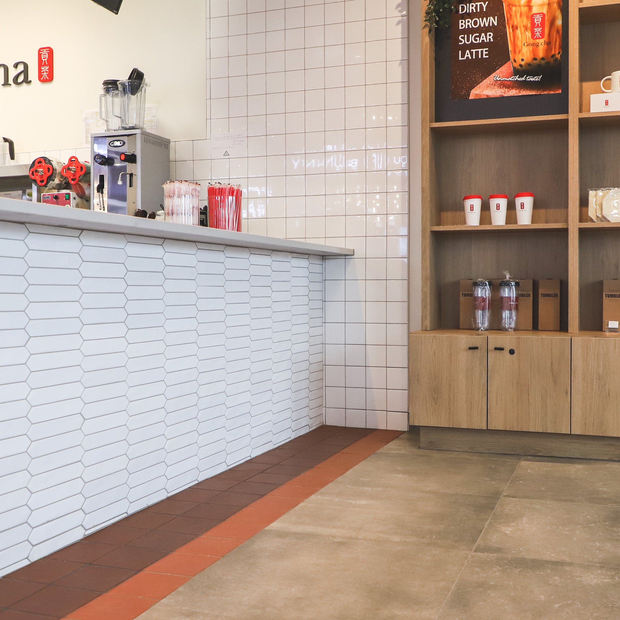
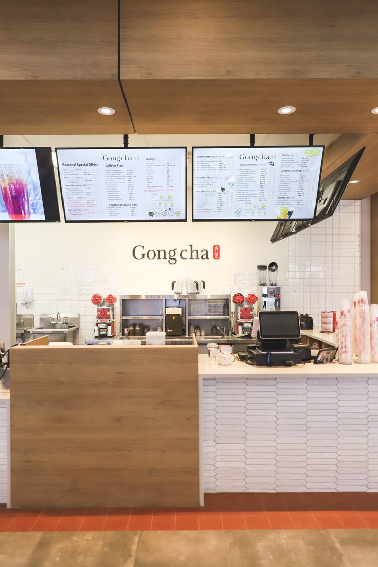
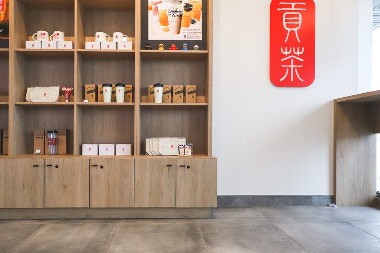
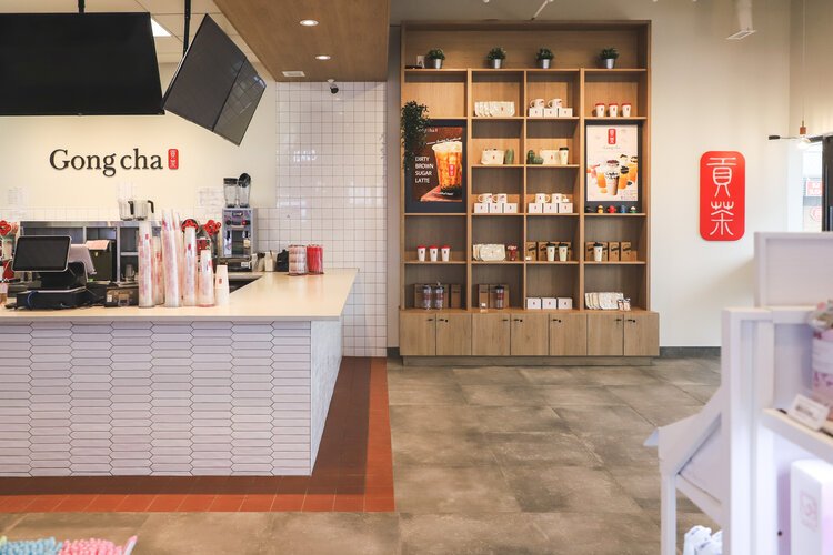
We added brand centric red tile on the floor that also acted as a directive for where customers could stand while waiting for their orders. Custom display shelves featured prominently near checkout, showcasing a wide range of branded product.
It was also important for Gong Cha staff to have space to display product posters, which incorporated within the display shelving, allowing promotional posters to be easily switched out when needed.
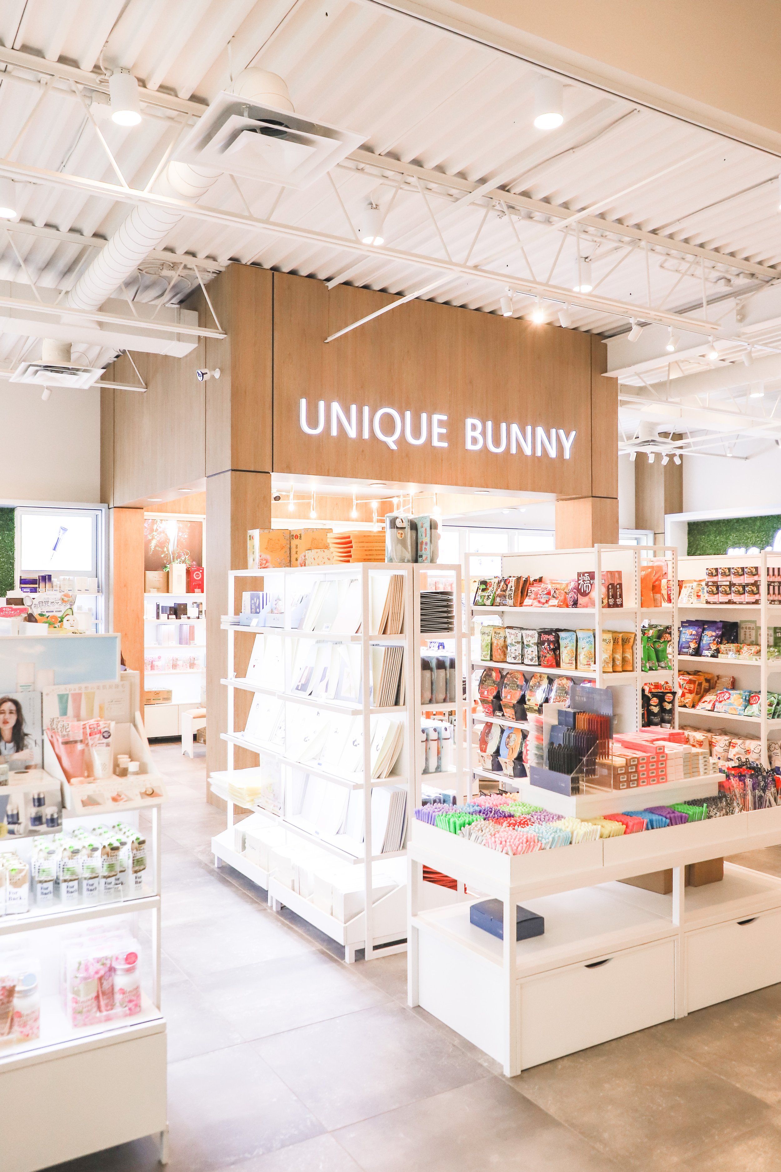
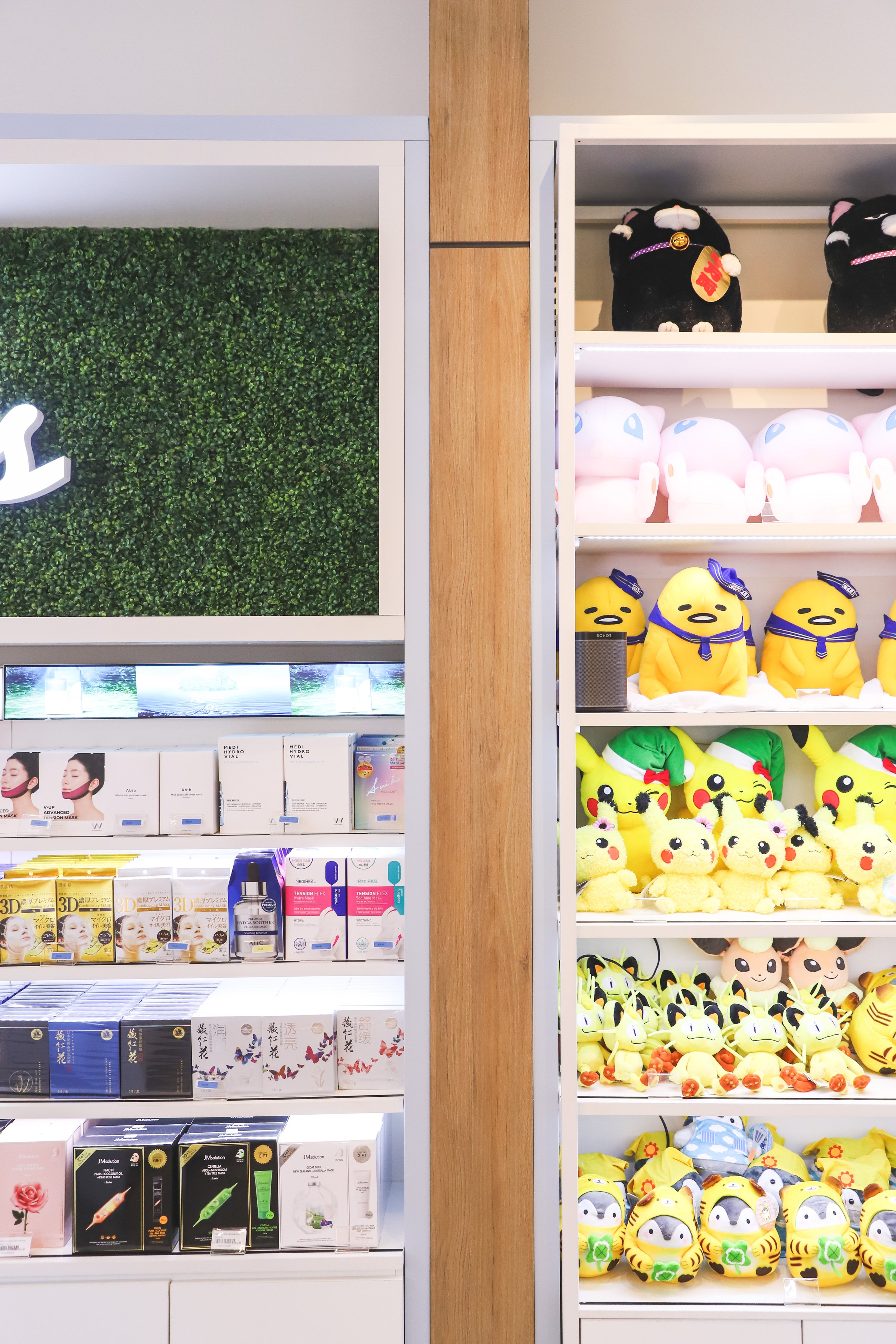
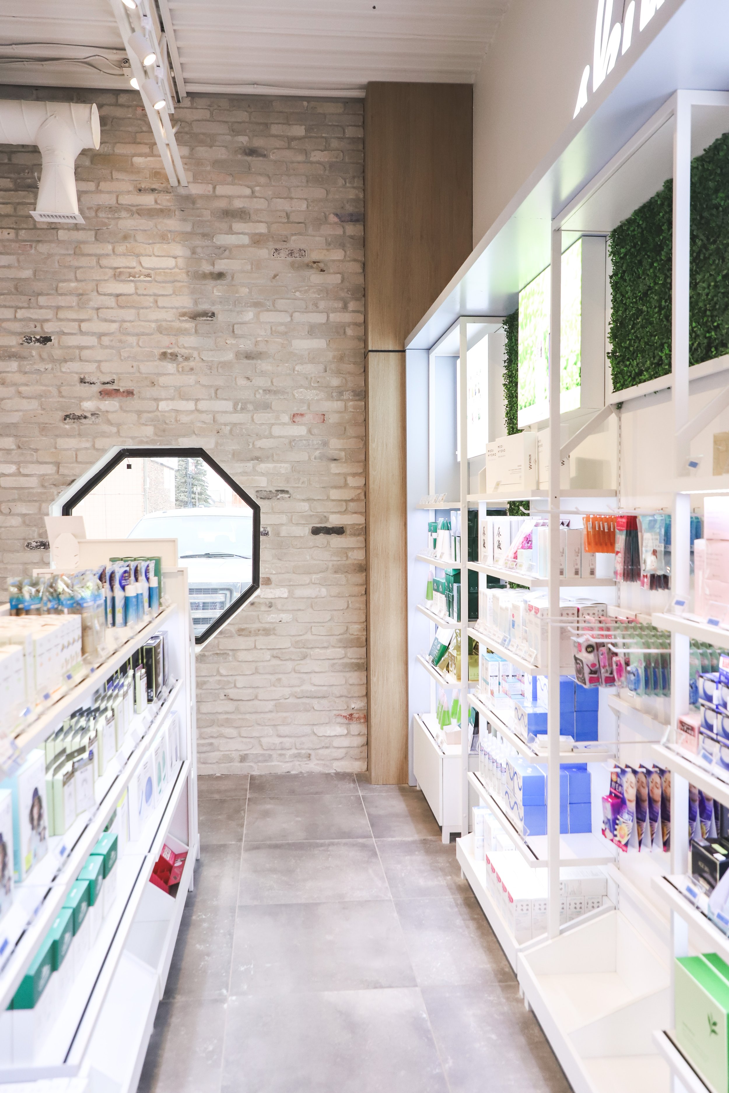
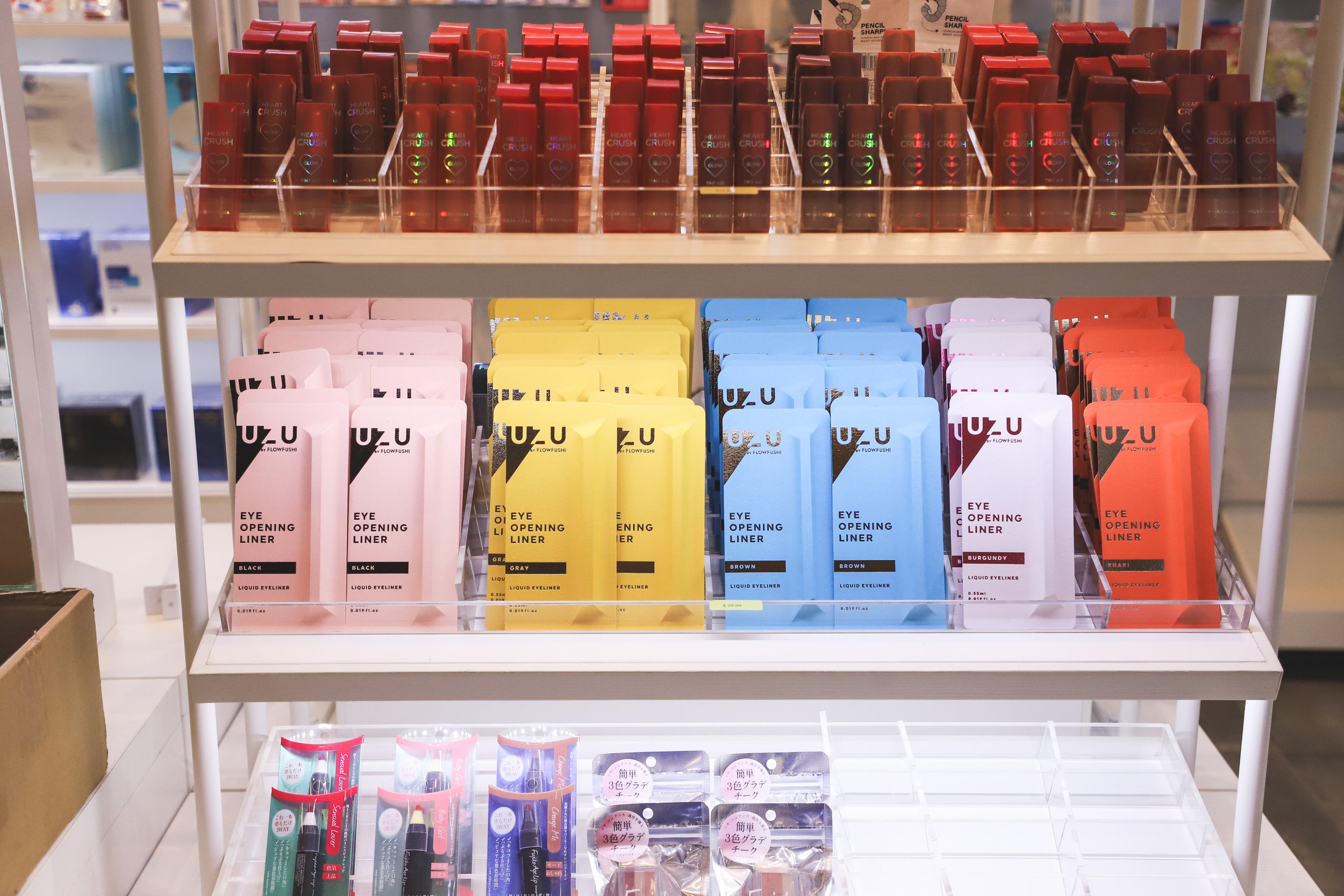
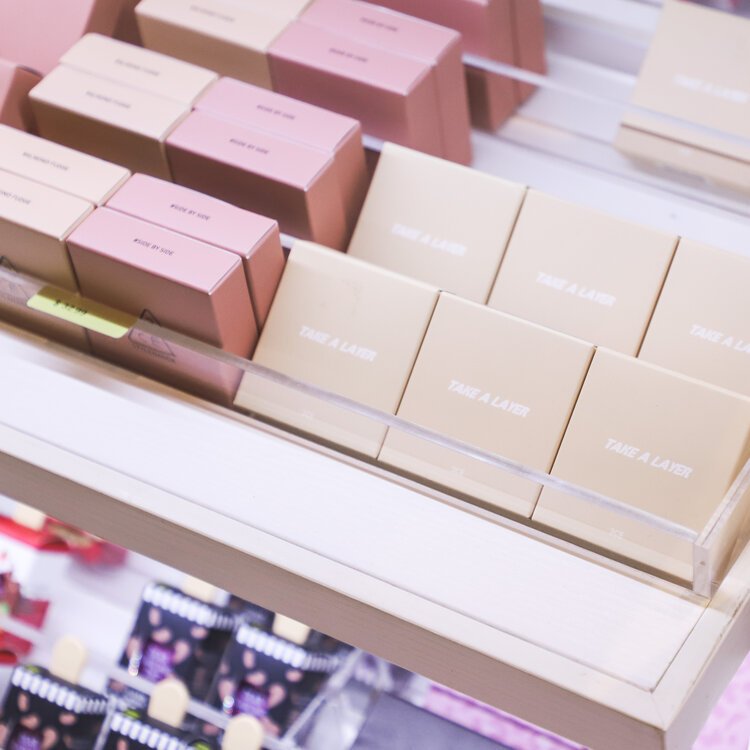
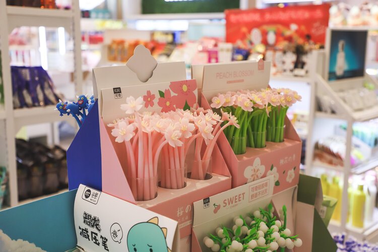
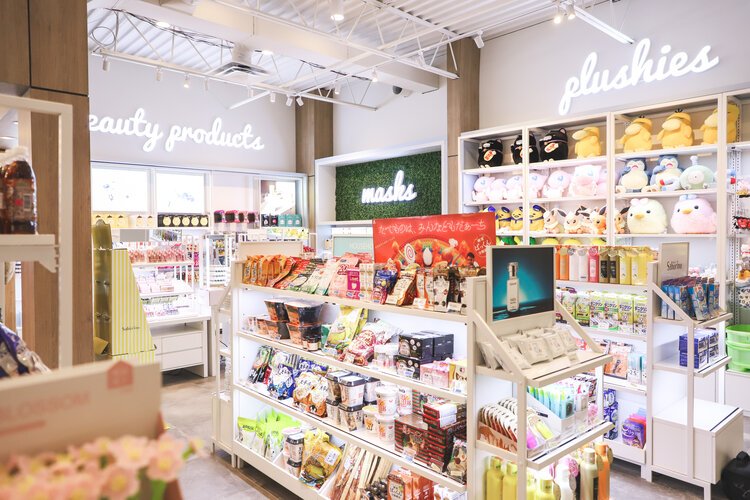
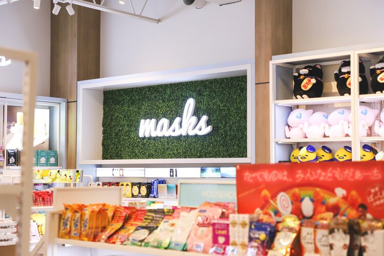
Unique Bunny sells a huge selection of Japanese and Korean beauty products, snacks, accessories and more. Our goal was to display this wide range of products in a visually cohesive way using shelving that had been purchased from China.
We created a space plan for the shelving units as well as zones for different categories of products.
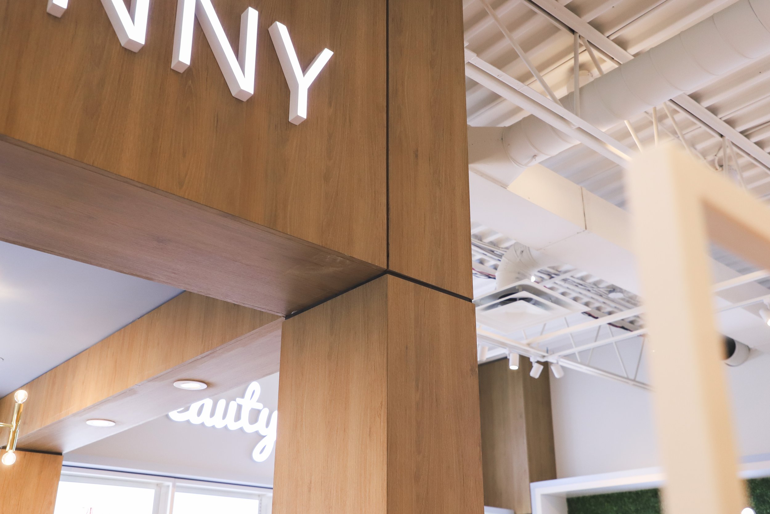
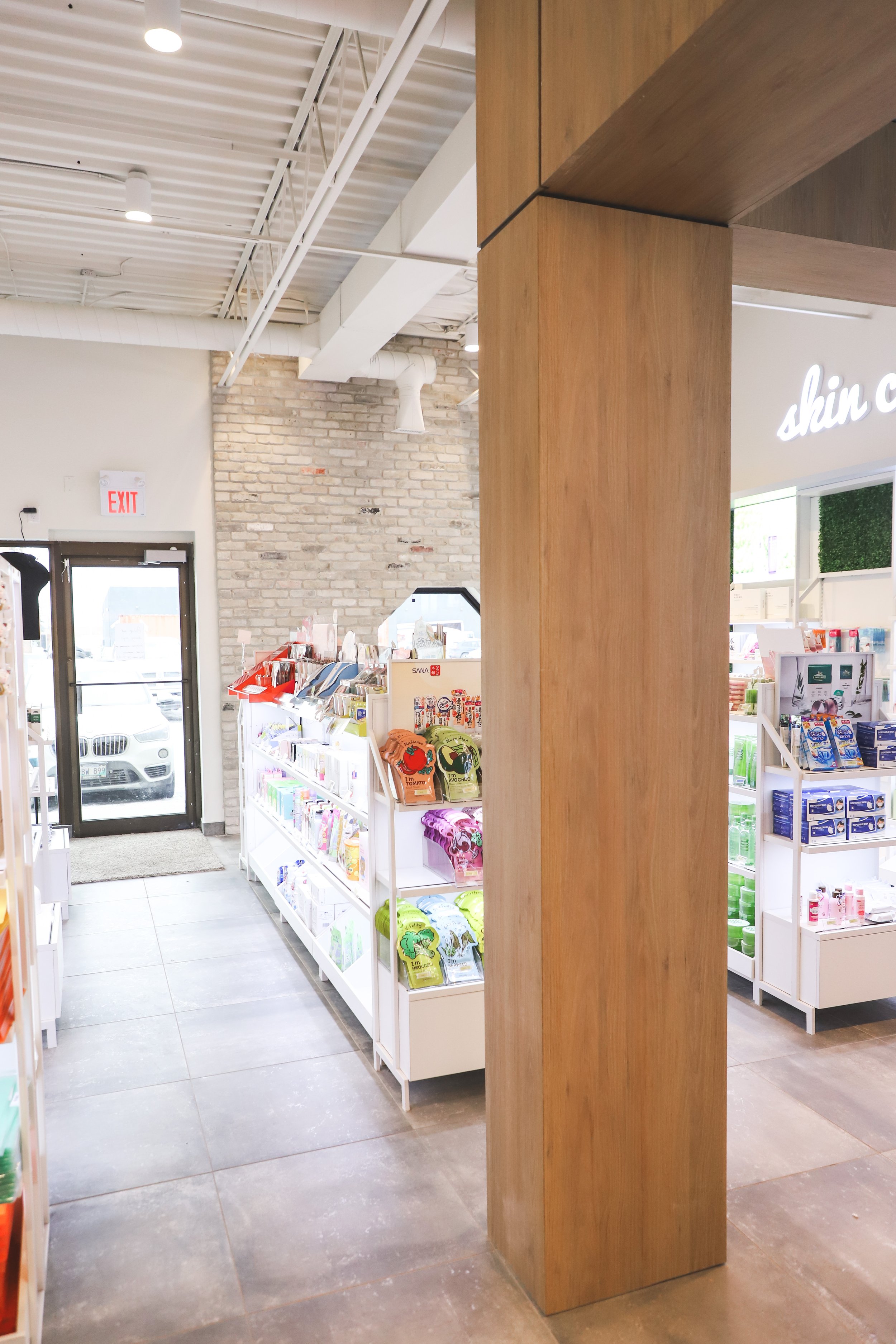
A key design element was determining how to give prominence to the checkout desk. We worked around an existing column by building it out with the same wood material used throughout the space. This created a room-within-a-room effect, with specialty lighting and signage that ensured customers could find their way to the cash desk.
We repeated these column details in between different sections of product, allowing for specialty signage on the walls that distinguished each product category.
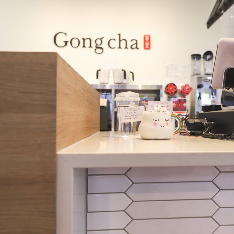
Some additional playful details included incorporating several white tile shapes that added visual interest on the Gong Cha side, and adding faux greenery – a nod to nature – on Unique Bunny’s side.
Overall, we created a space that made sense – whether looked at separately or as a whole. We incorporated two brand identities into one retail space, giving customers a unique shopping experience.

