BECK COVE
BUILD Dynasty Homes
PHOTOGRAPHY Nowaday Studio
We’ve worked with Dynasty Homes for years now and we always love collaborating with owner, Rick on his new builds and show homes. This bungalow in Charleswood was no exception.
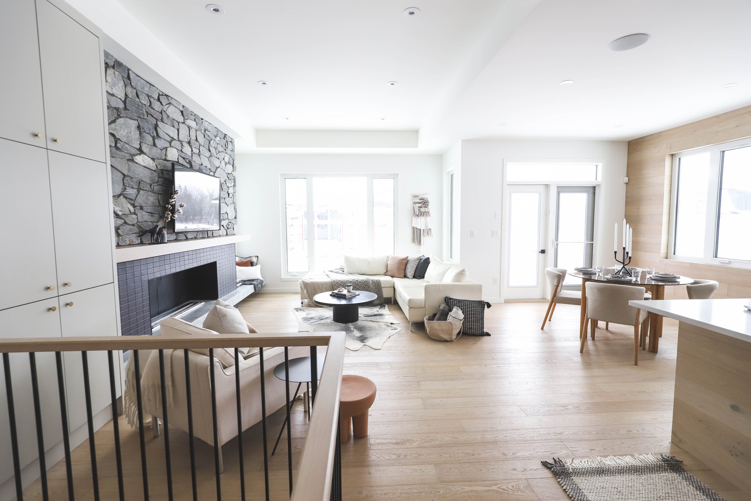
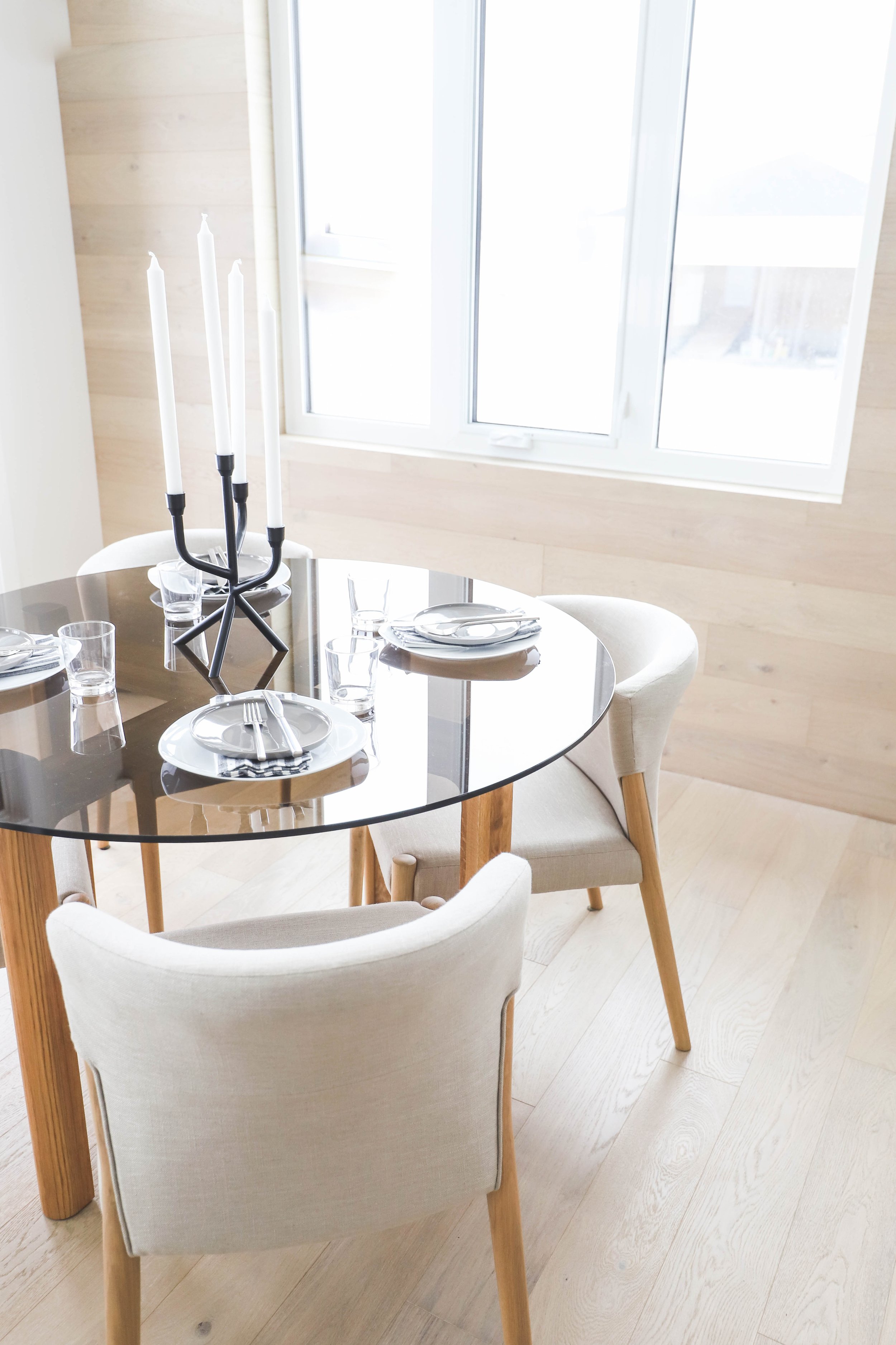
With modern sensibilities in mind, we designed an open floor plan home, creating a space that embraces natural light and embodies a sense of peace.
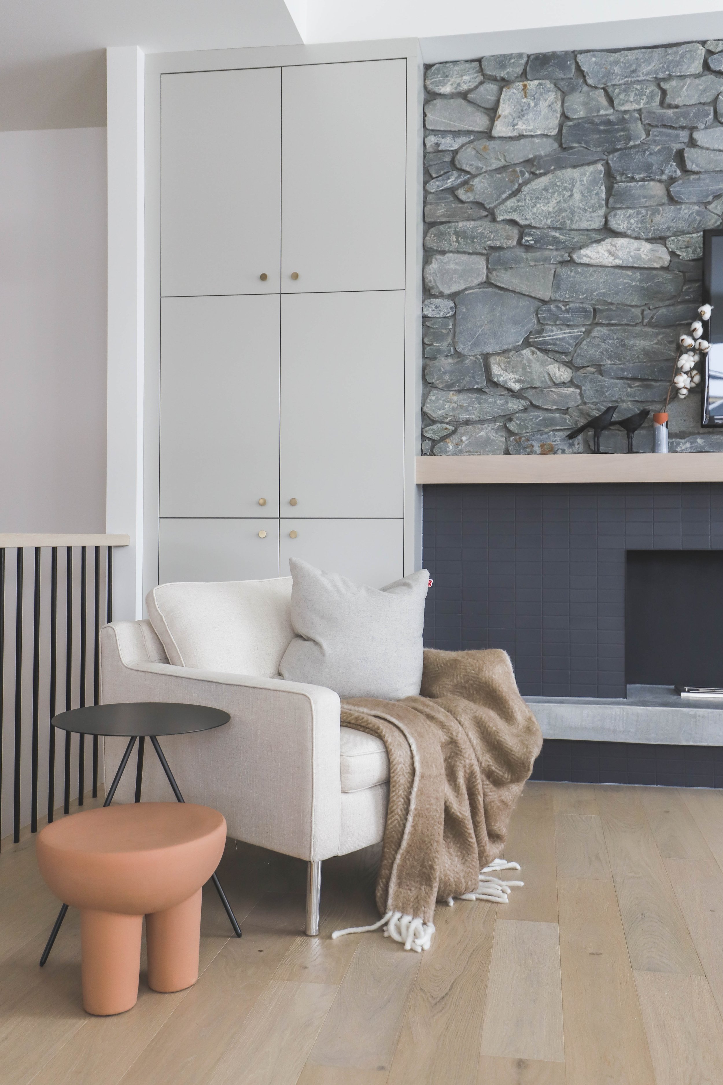
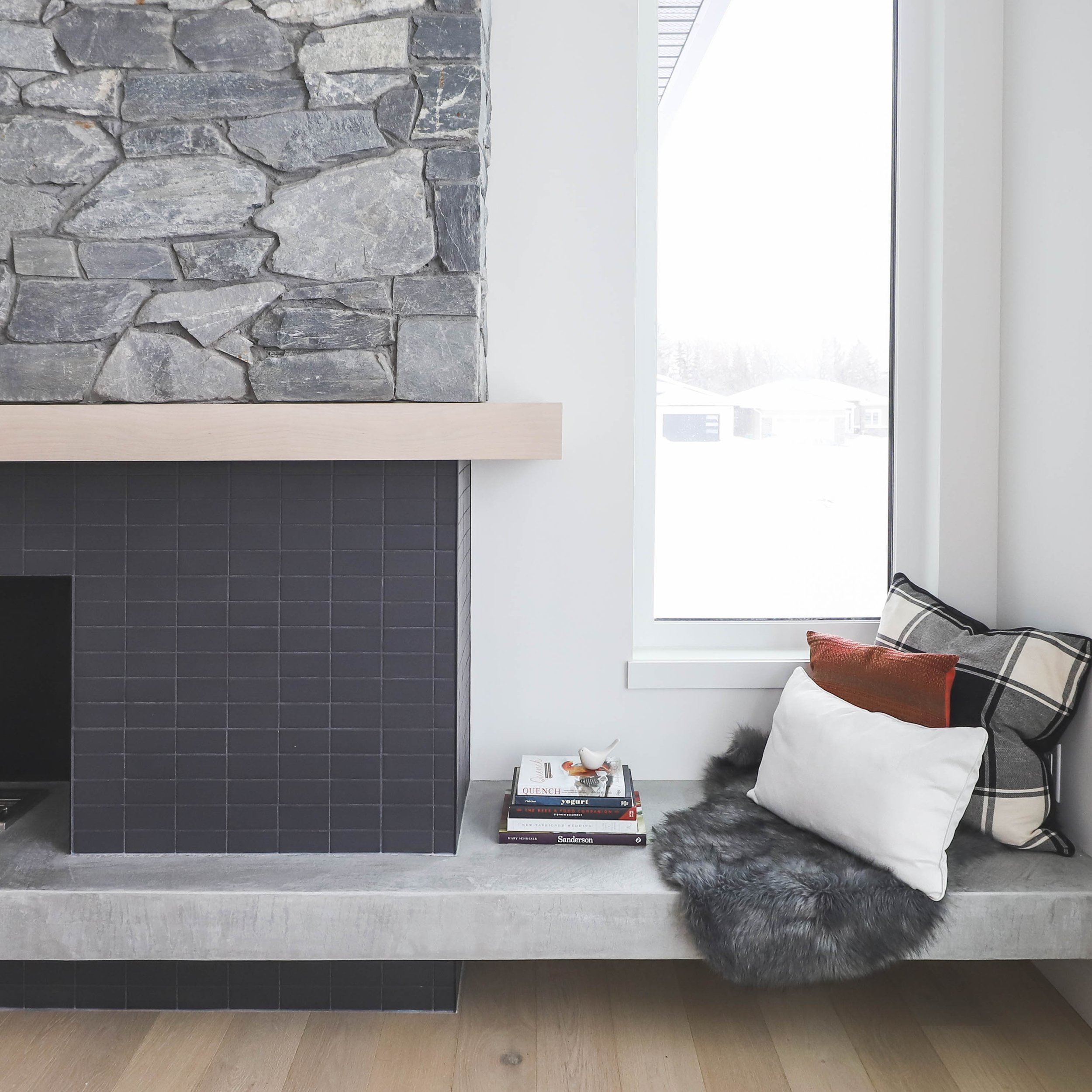
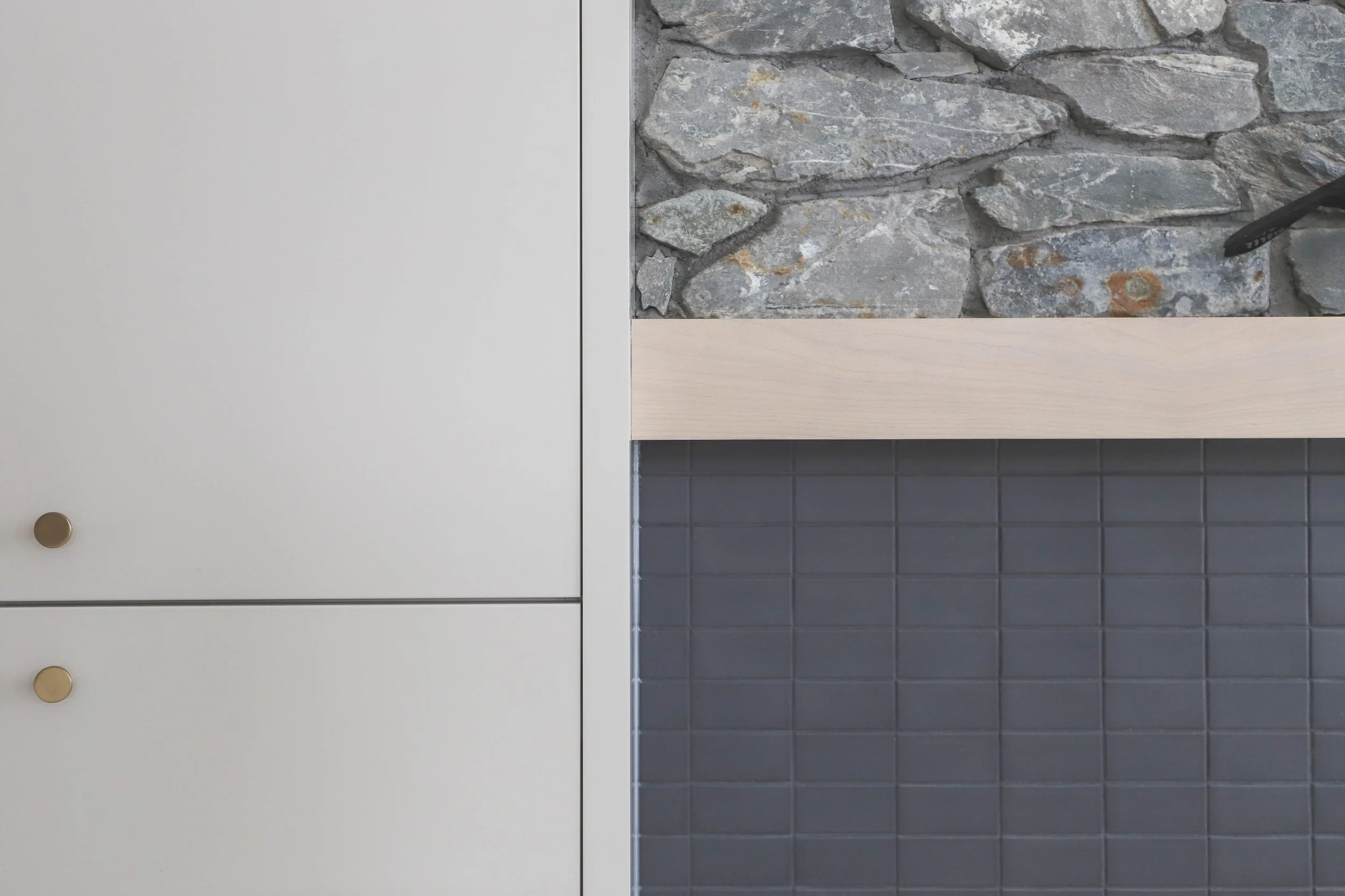
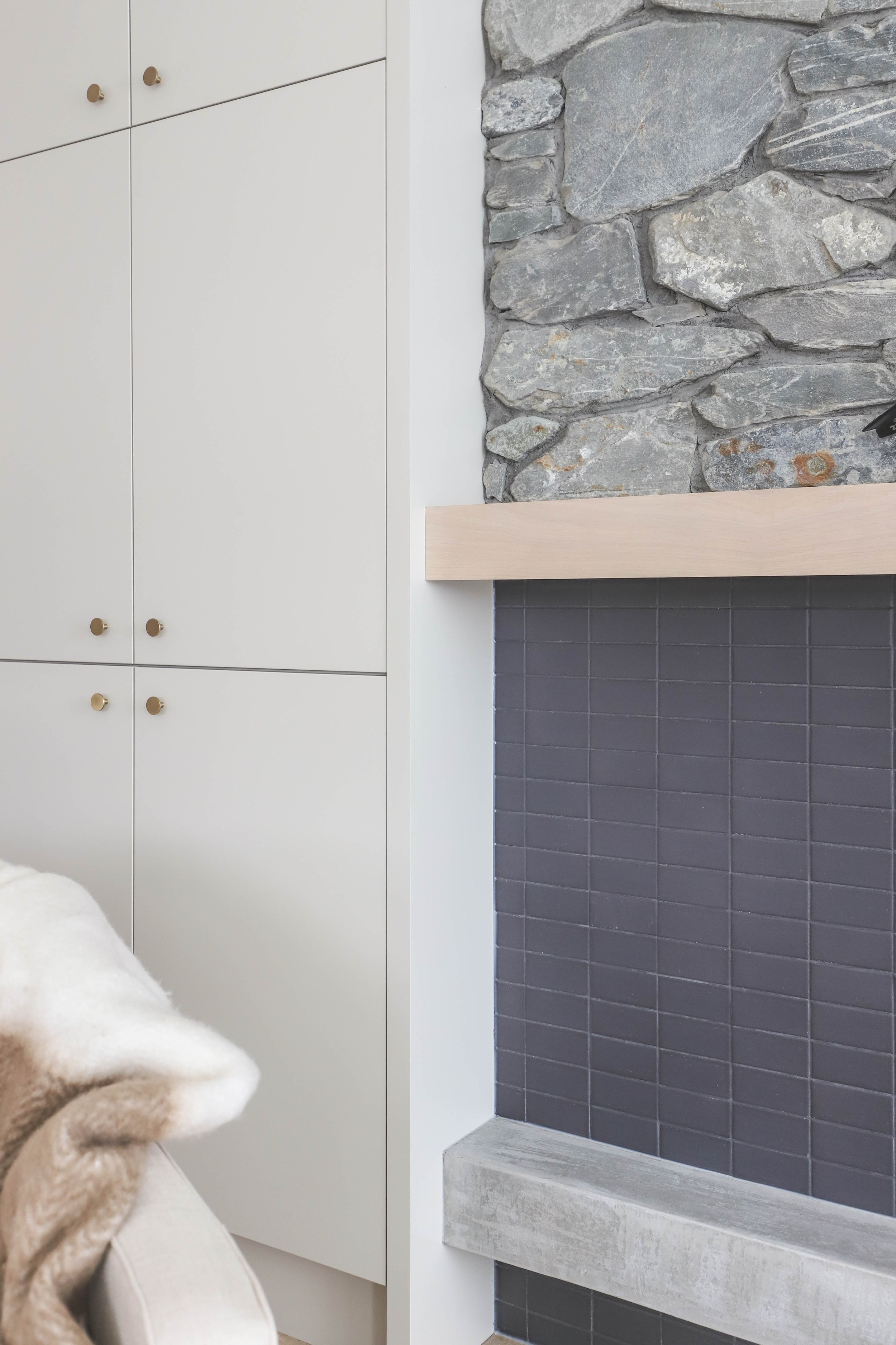
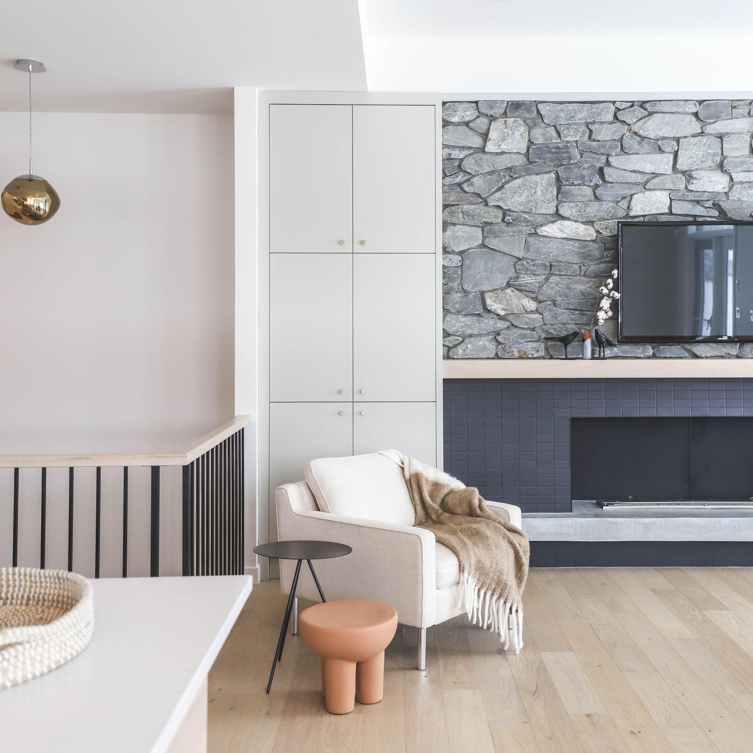
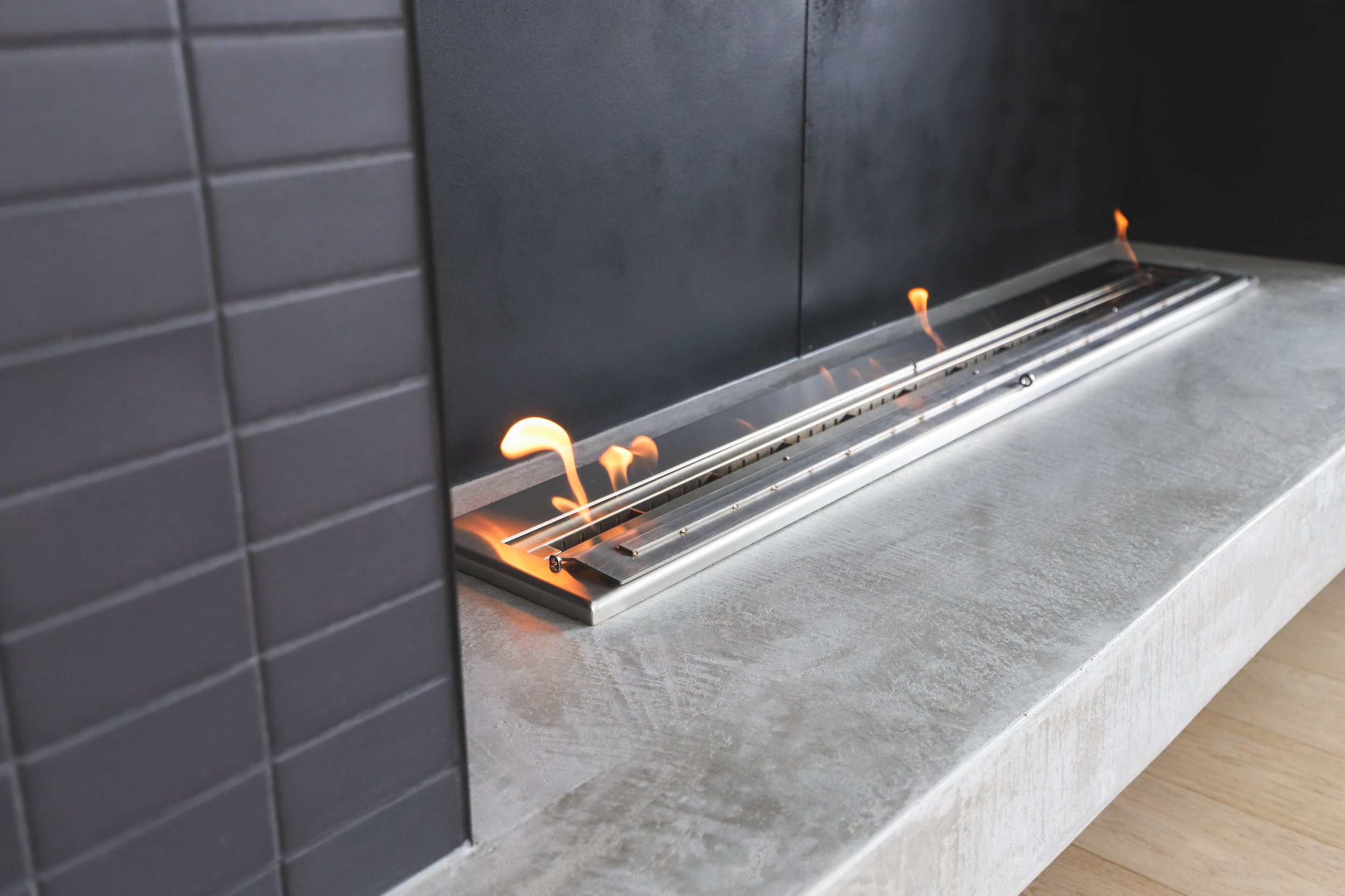
Since we didn’t have specific client preferences to consider, we saw this home as a blank canvas that allowed us to play with neutral colours, and emphasize the natural light pouring in through the numerous windows. We focused on how a family might engage, while maintaining a space inspired by a cozy oasis. We incorporated touches like a show stopping fireplace and mantle complete with stone texture and a hearth that extends to include seating and storage.
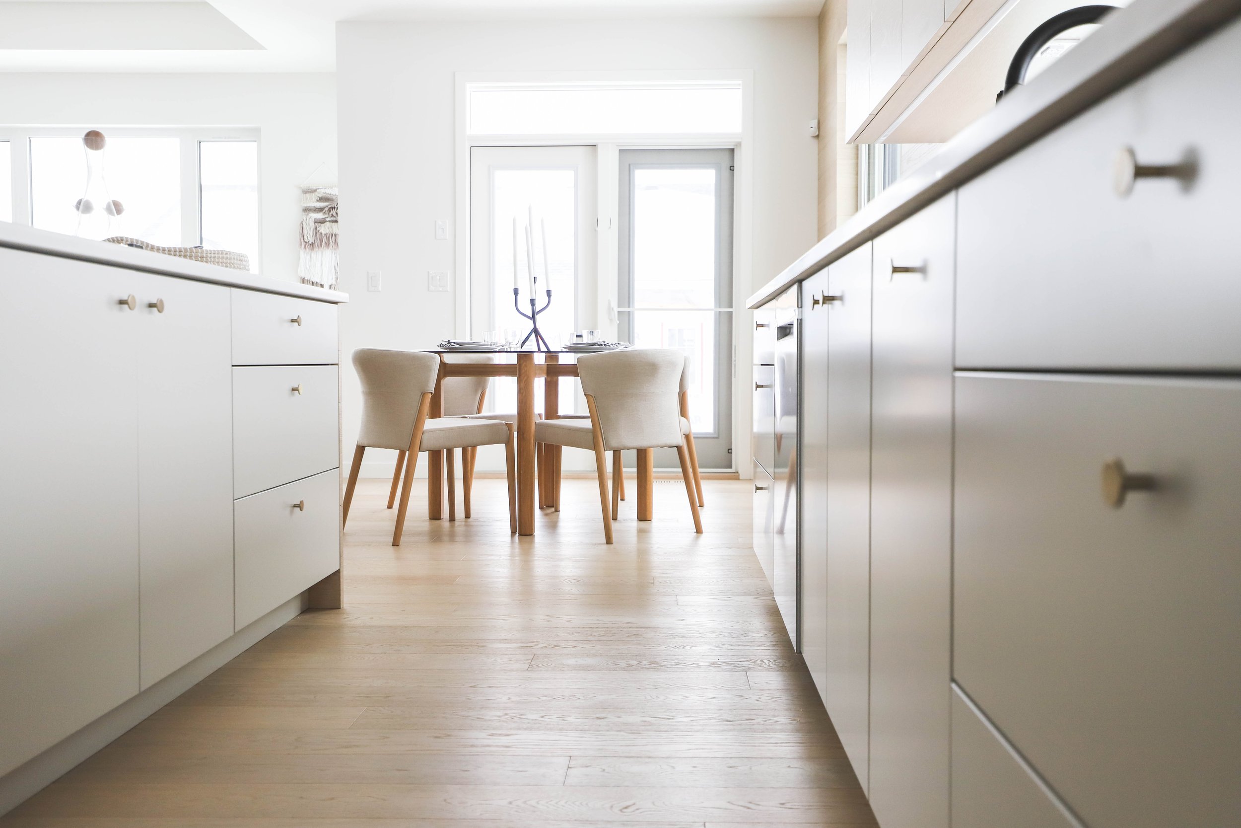
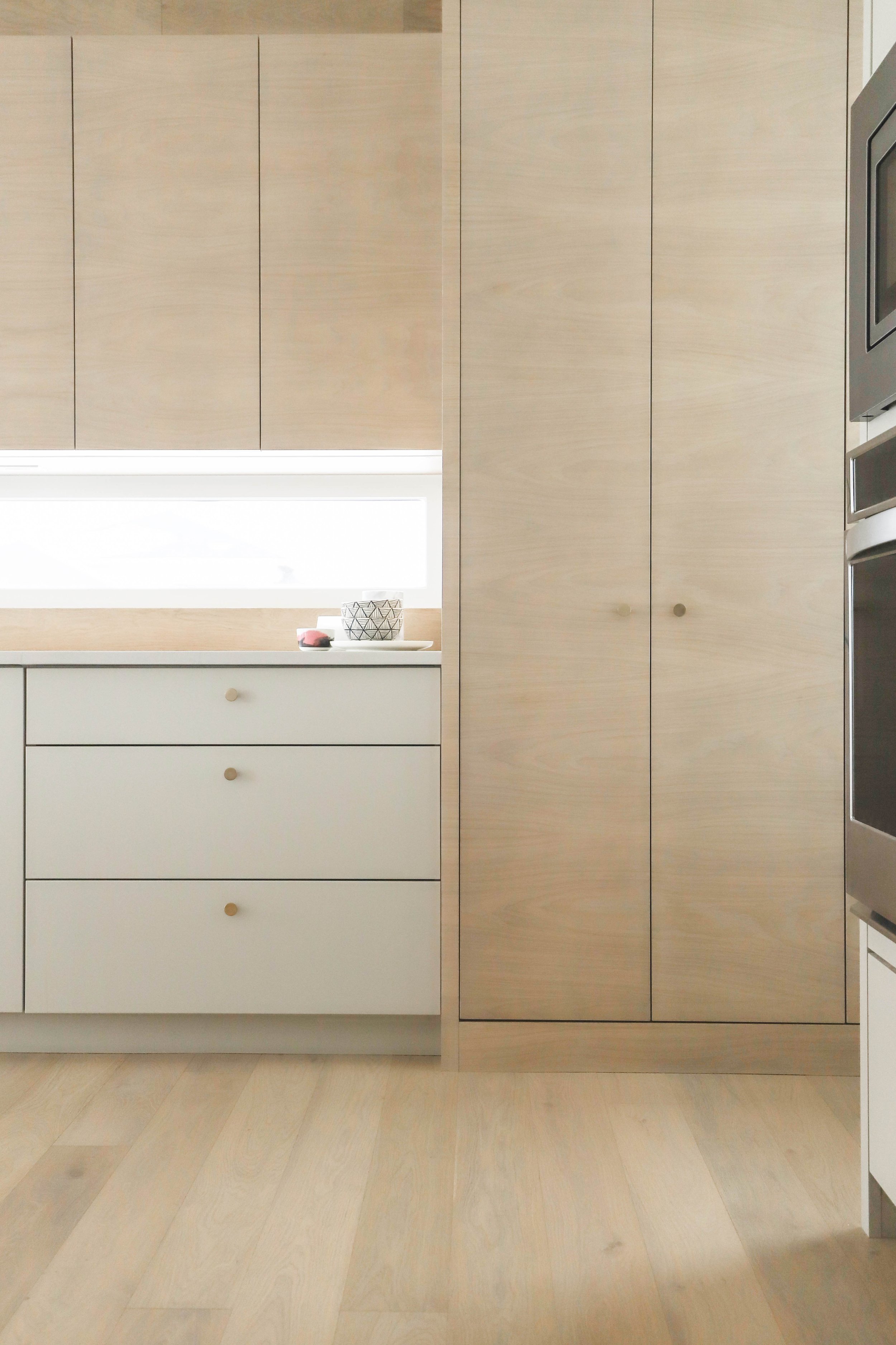
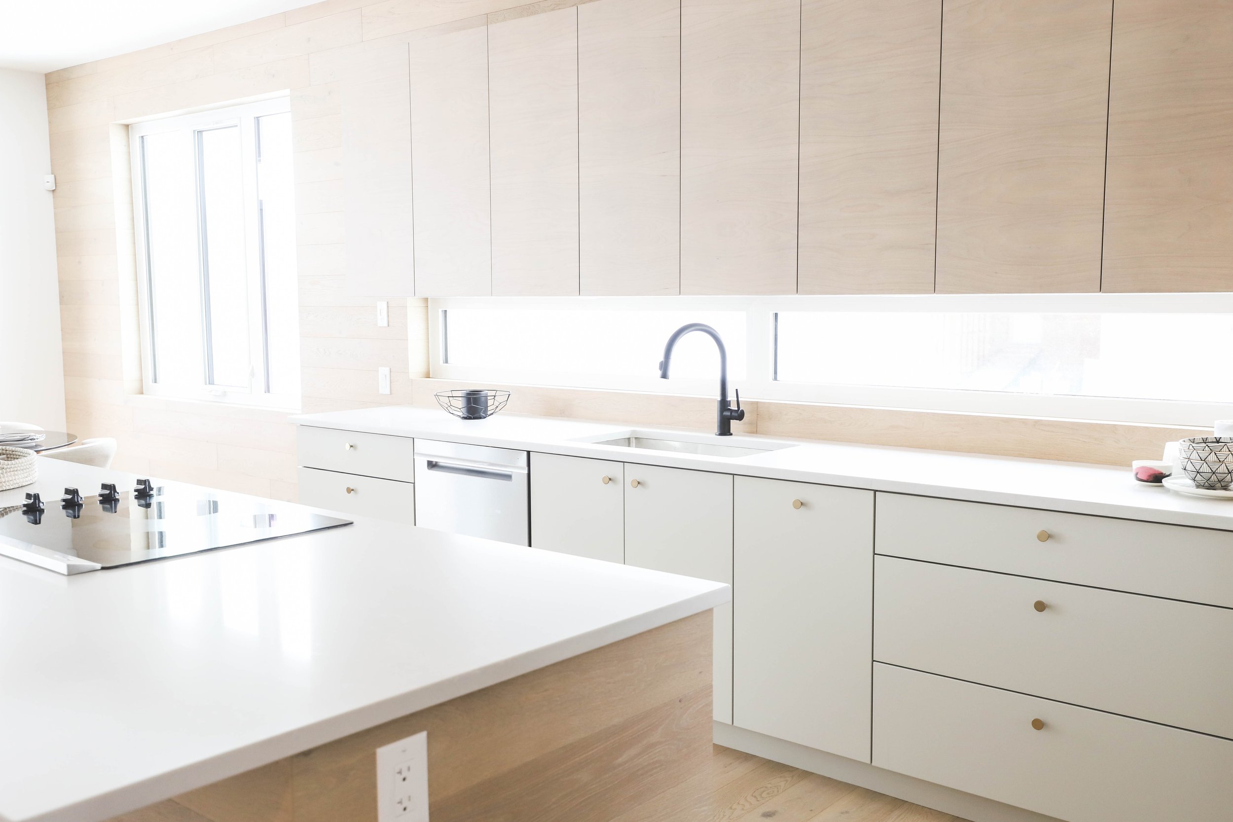
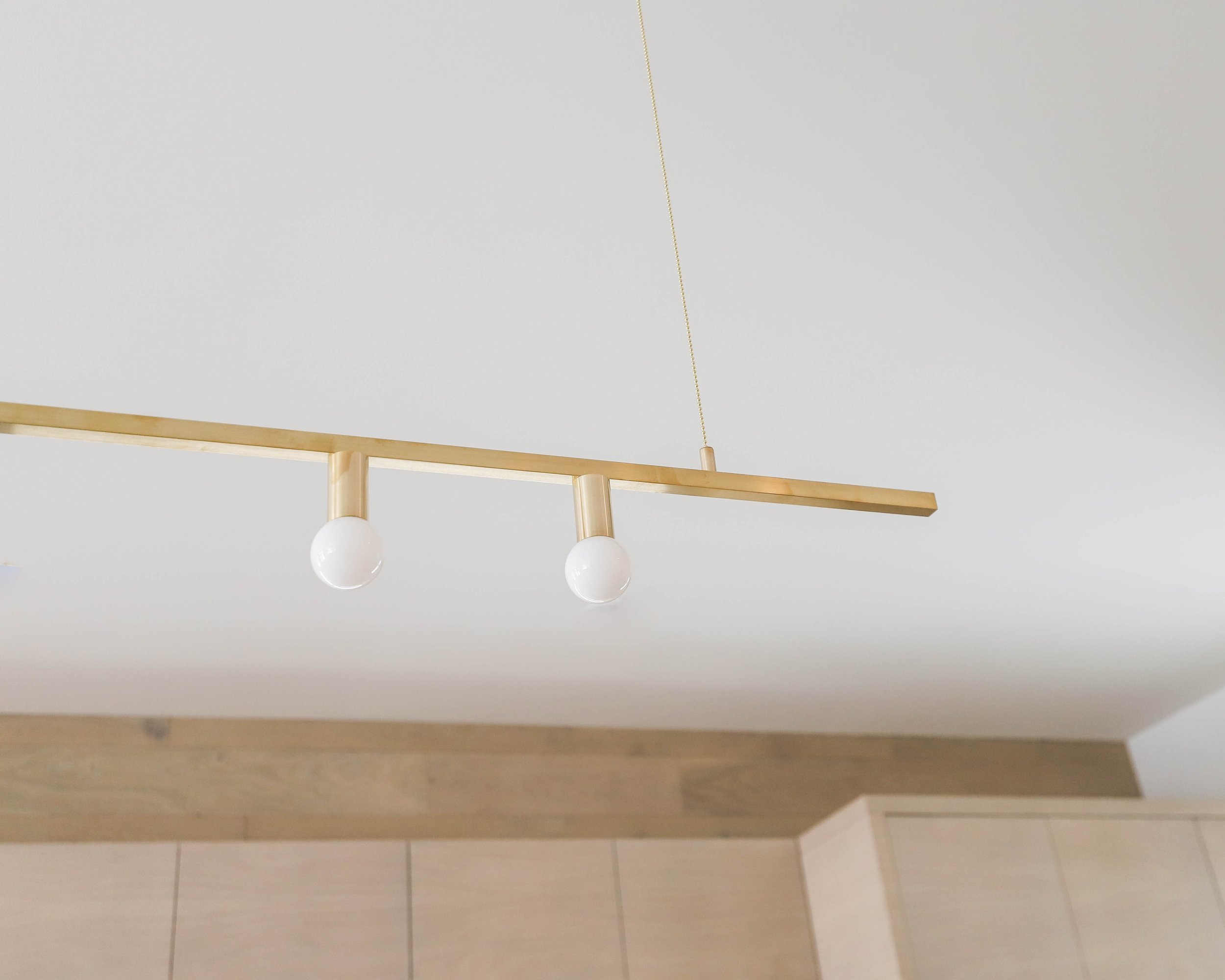
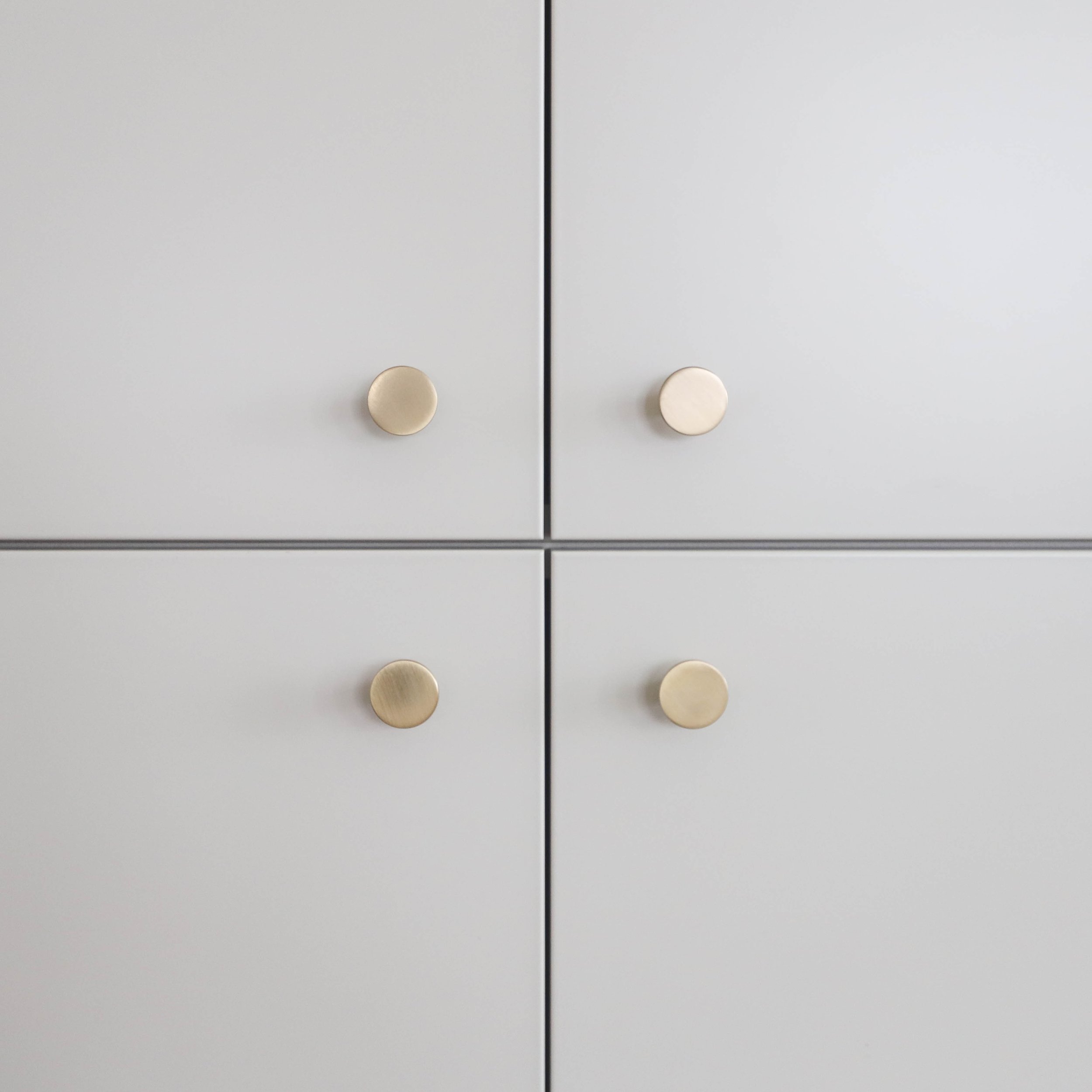
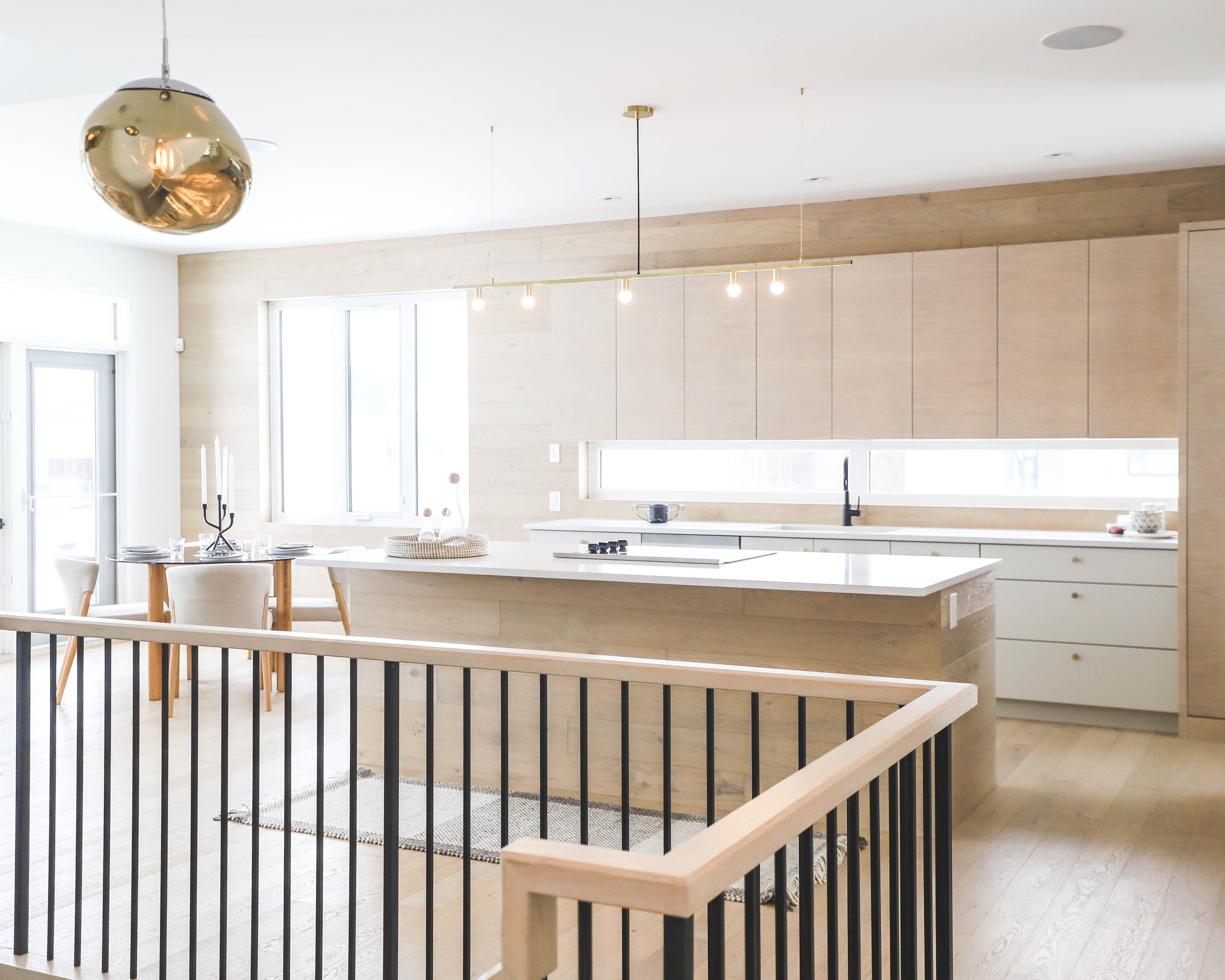
The open kitchen included a spacious island with flooring wrapped onto the island and walls. We used lighter toned wood flooring to help the space feel refined, but not rustic. Cabinets were custom designed to match and camouflage into the kitchen area, accessorized with a touch latch feature that felt sleek and simple.
A long window between the upper cabinets and counter allowed us to maximize the natural light without taking away storage space above the sink. We paired the wood with a warm grey tone and implemented brass features on the lower cabinets
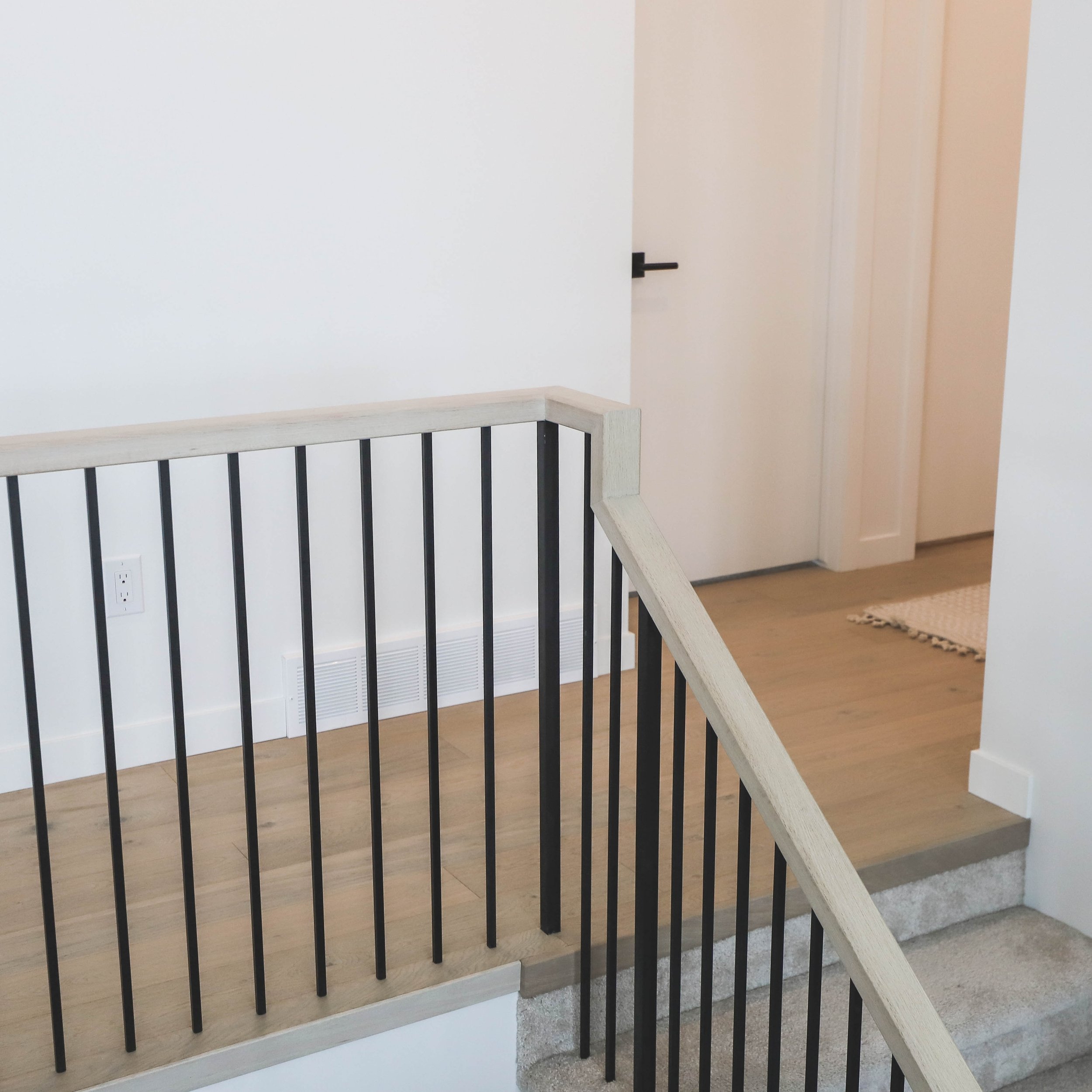
Open railing leading to the lower level is a focal point when you enter the home. We wanted the railing to be a simple but impressive cornerstone of the home design; as such, we added wood on top with black spindles to achieve an emphasized look.
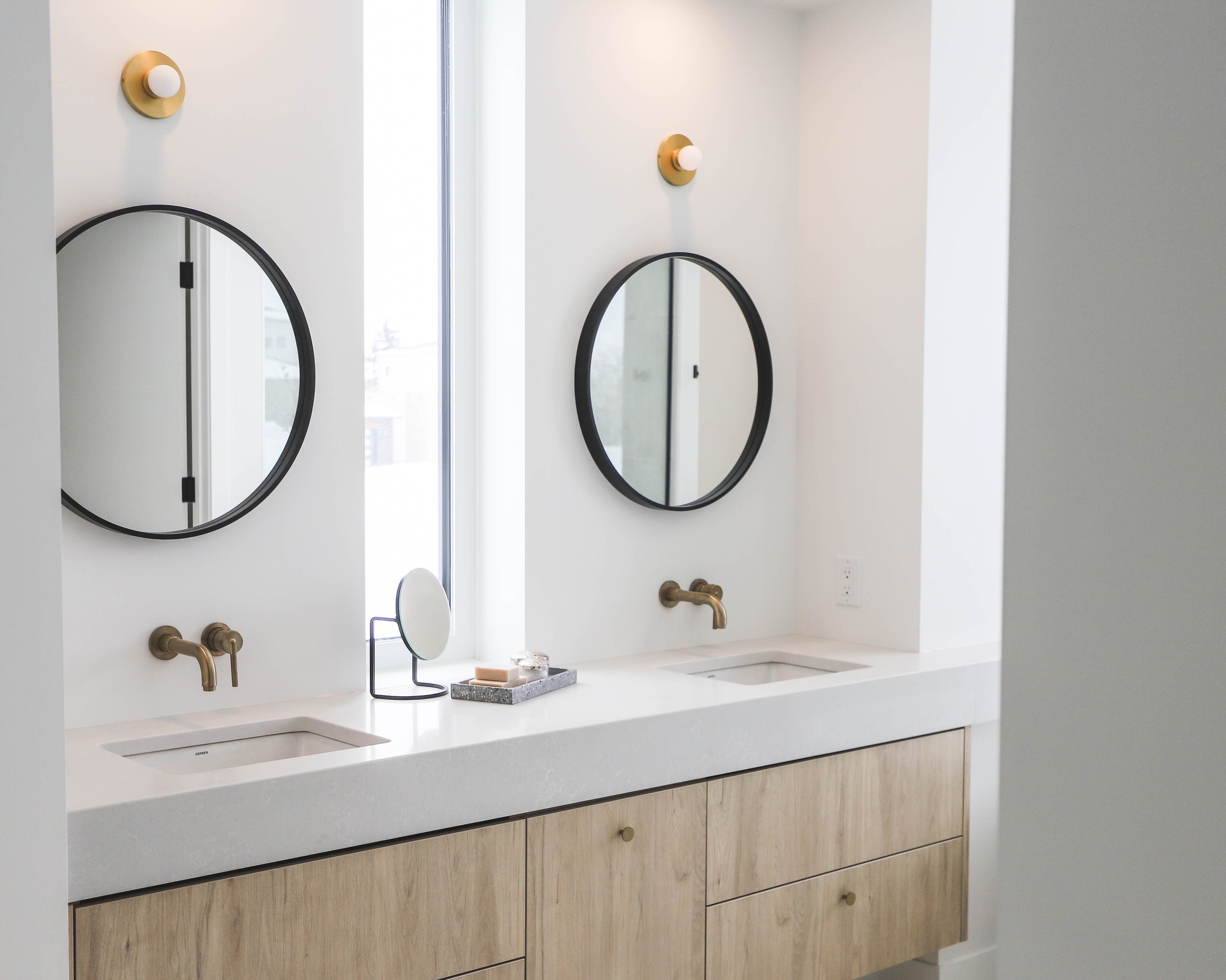
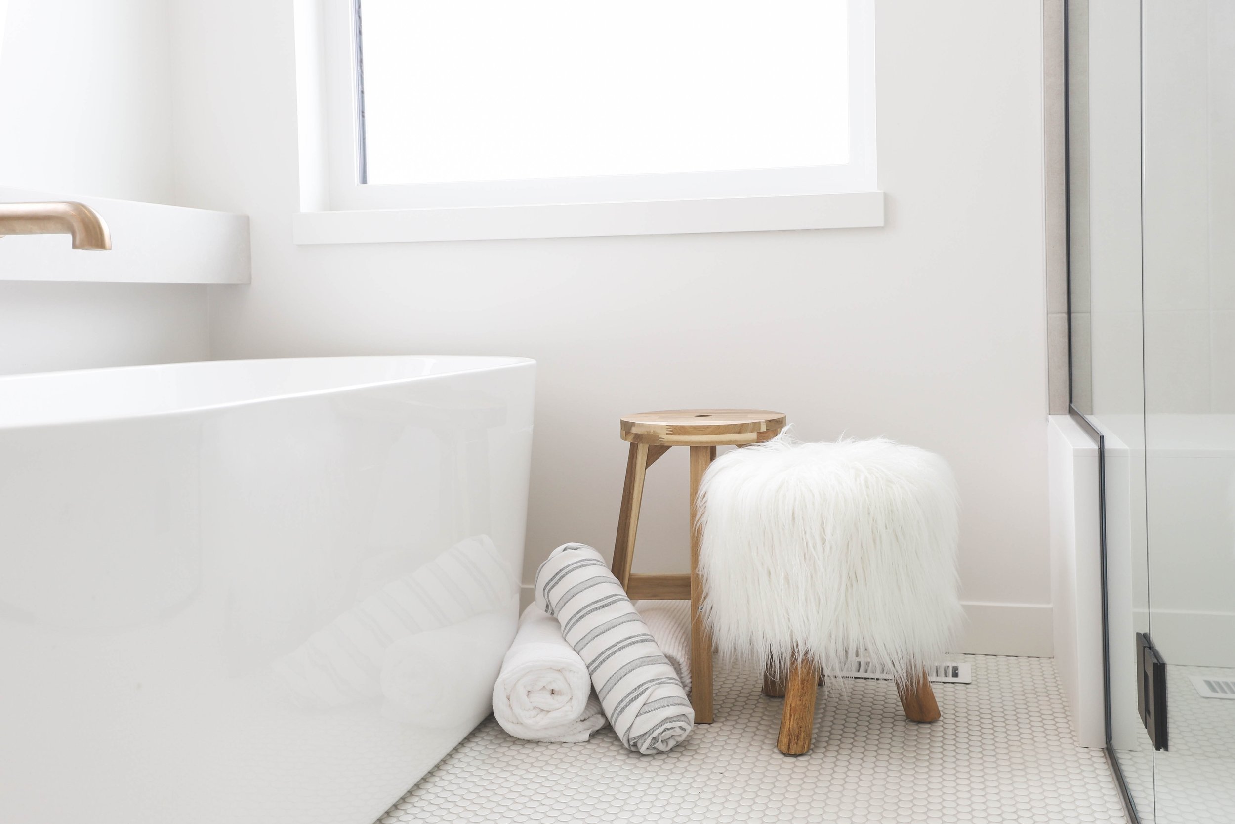
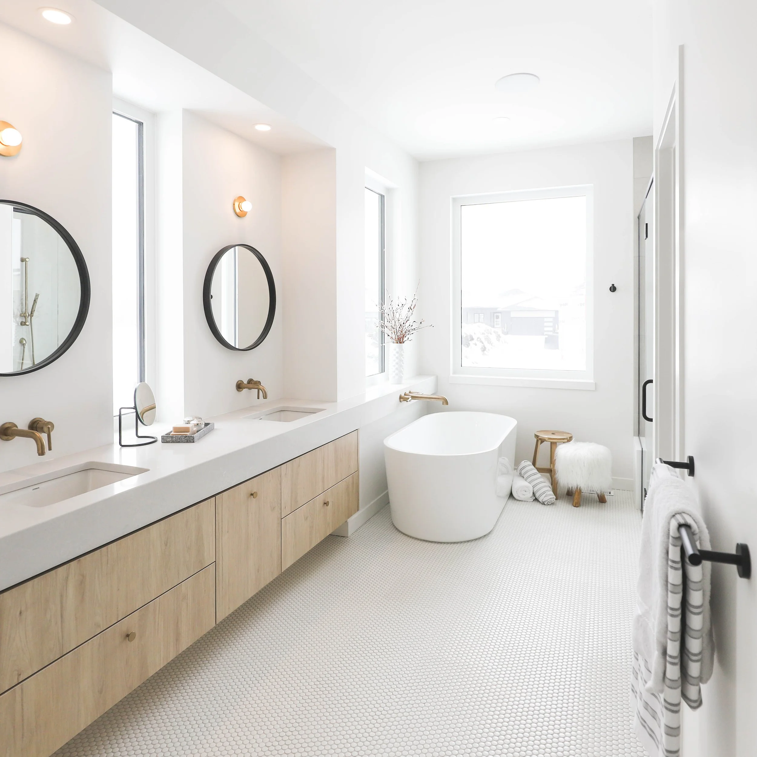
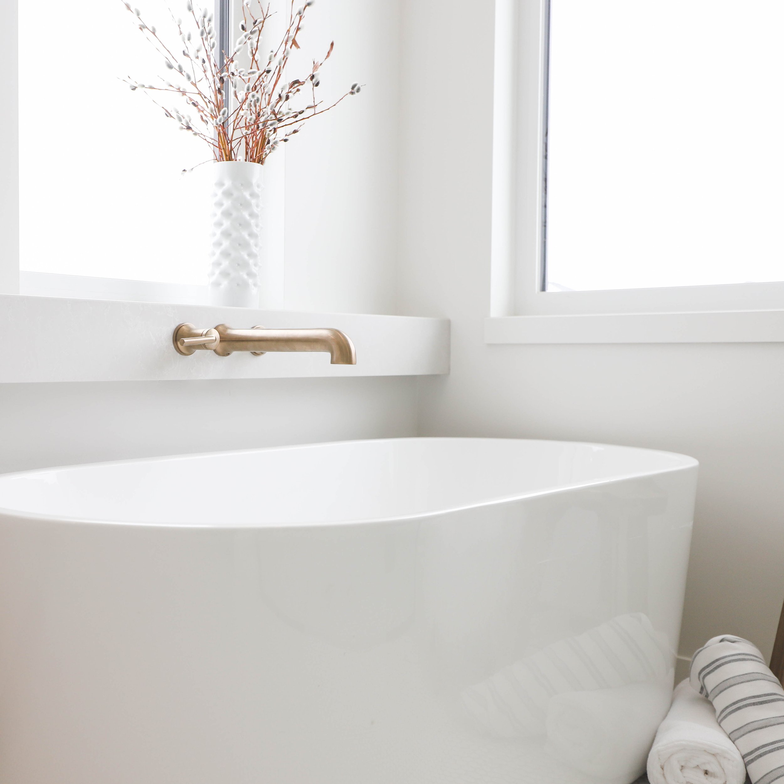
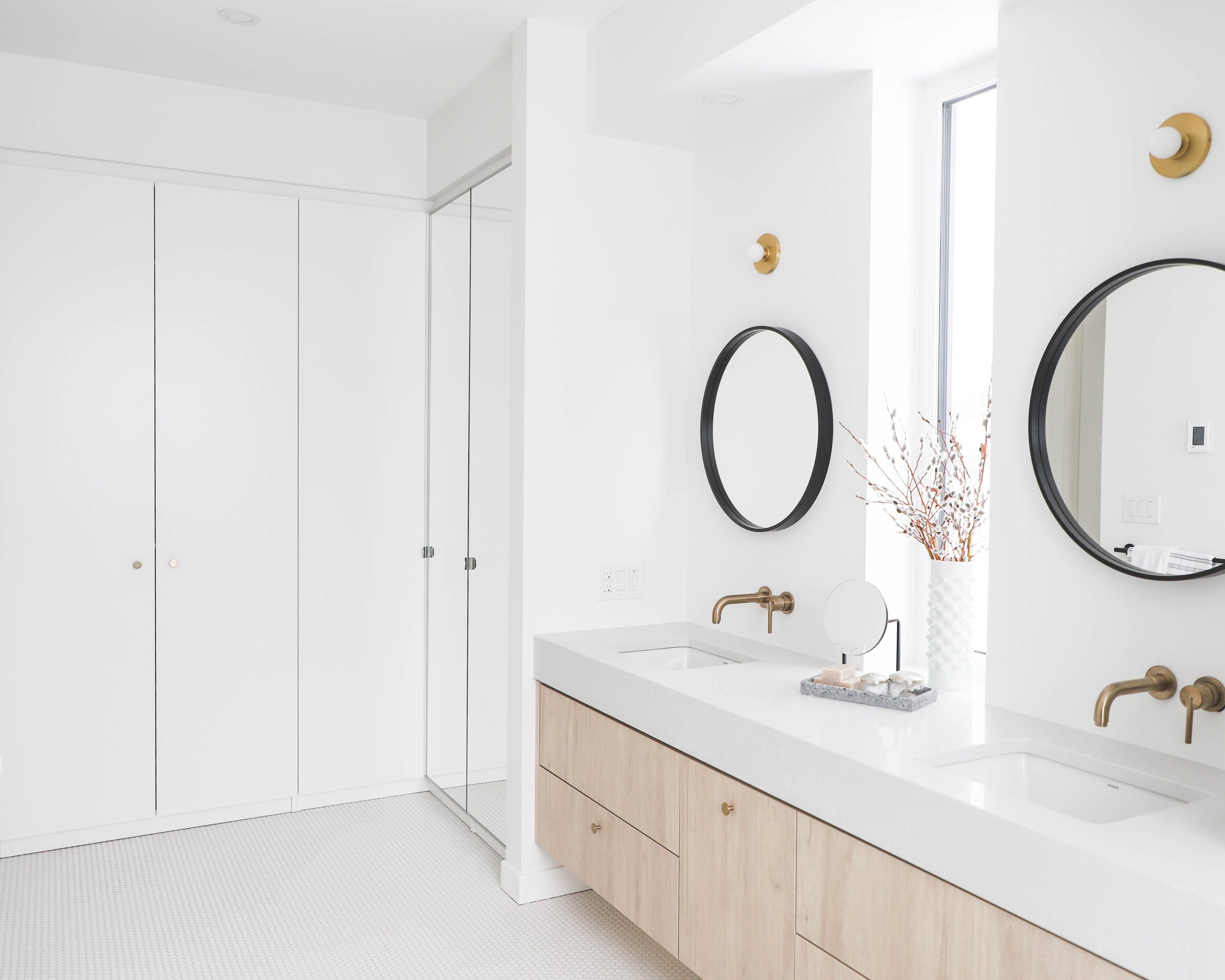
When you enter the primary bedroom, you can immediately see into the adjacent ensuite. We kept it light and airy while bringing in a luxurious and spa-like feel to the space. Design features include building up the countertop to extend across to the freestanding tub, which created space for wall mounted features.
Windows between the mirrors enabled us to incorporate as much natural light as we could without taking away from mirror space. Wall mounted faucets were also included above the sink. Using penny round tile played with scale and added comfort when you walk through the space. The large shower was designed so you could walk right in (without needing a shower lip seal), with a bench for seating and storage. Since the ensuite was an open design, we ensured privacy by including a separate water closet.
Needless to say, this show home sold fast and we’re so glad this space is being used by a family who loves all of these bespoke details.

